
Well folks, you’ve seen peeks here and there, but I’m excited to officially start sharing ‘Room Reveals’ from our Charleston home one by one. First up: The Dining Room. Something I like to call a little Farmhouse Glam Dining Room. Which, for an open concept floor plan, is nothing overly formal or complicated, but nonetheless an important space in our home.
I worked closely with Lizz Luckhart Designs {a local bridal + interior expert} to conceptualize each space within our home. We started with larger pieces and statement areas, such as the couch and wallpapered staircase, and filled in the rest from there. From the beginning I was pretty open to trying new things, but was pretty adamant about two things:
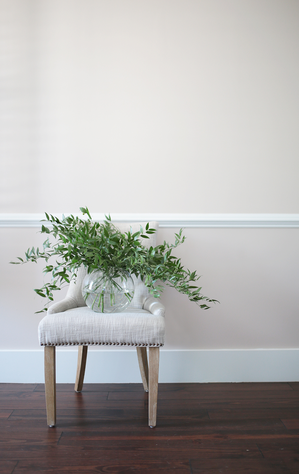
- The home needed to feel warm + homey. In our previous living spaces, I somehow would get stuck in this monochromatic everything décor vibe, that really wasn’t representative of Sterling or I’s personality/tastes. I mean hello, I love color! But always had a hard time settling on what to incorporate color into our home. I’d tend to stick to cool greys, blues + stark white {as in of our old Master Bedrooms}. Which don’t get me wrong, I do still love, but it just didn’t feel like ‘us’. Sterling made a comment to me at one point that he felt our home ‘didn’t feel homey’. At the time it kind of hurt my feelings, but I also understood where he was coming from. When we purchased this house back in March, I was determined to make it the HOMIEST home we had ever had! Determined. Of course the first time I had a chance to branch out {the downstairs paint}, I opted for cool, pale blues. Ugh. Thankfully Lizz came to my rescue and encouraged me to go in a different direction. Not to mention, I really wanted a deep, rich blue colored couch – which would have put us right back were we started – monochromatic central. This time is just would have been monochromatic BLUE! Can you imagine?! Anyhow, luckily I ultimately went with Serwin Williams’ Unfussy Beige and could not be more thrilled with how it turned out. I still cannot believe I went with a color that has the word ‘beige’ in it {something that usually makes me cringe}, but in our home it reads to soft and warm and has hints of pink undertones. It really fits the space perfectly and is so inviting.
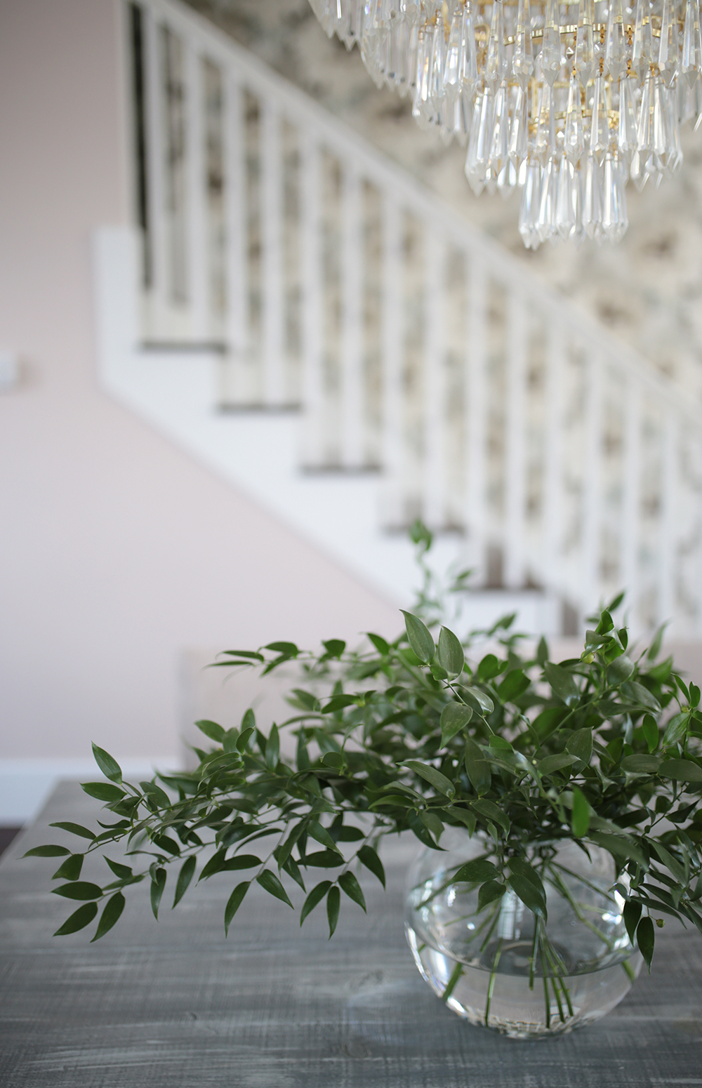
- Secondly, I HAD to have our entire 3-story staircase wallpapered. And what a mission that turned into haha. More on that later.
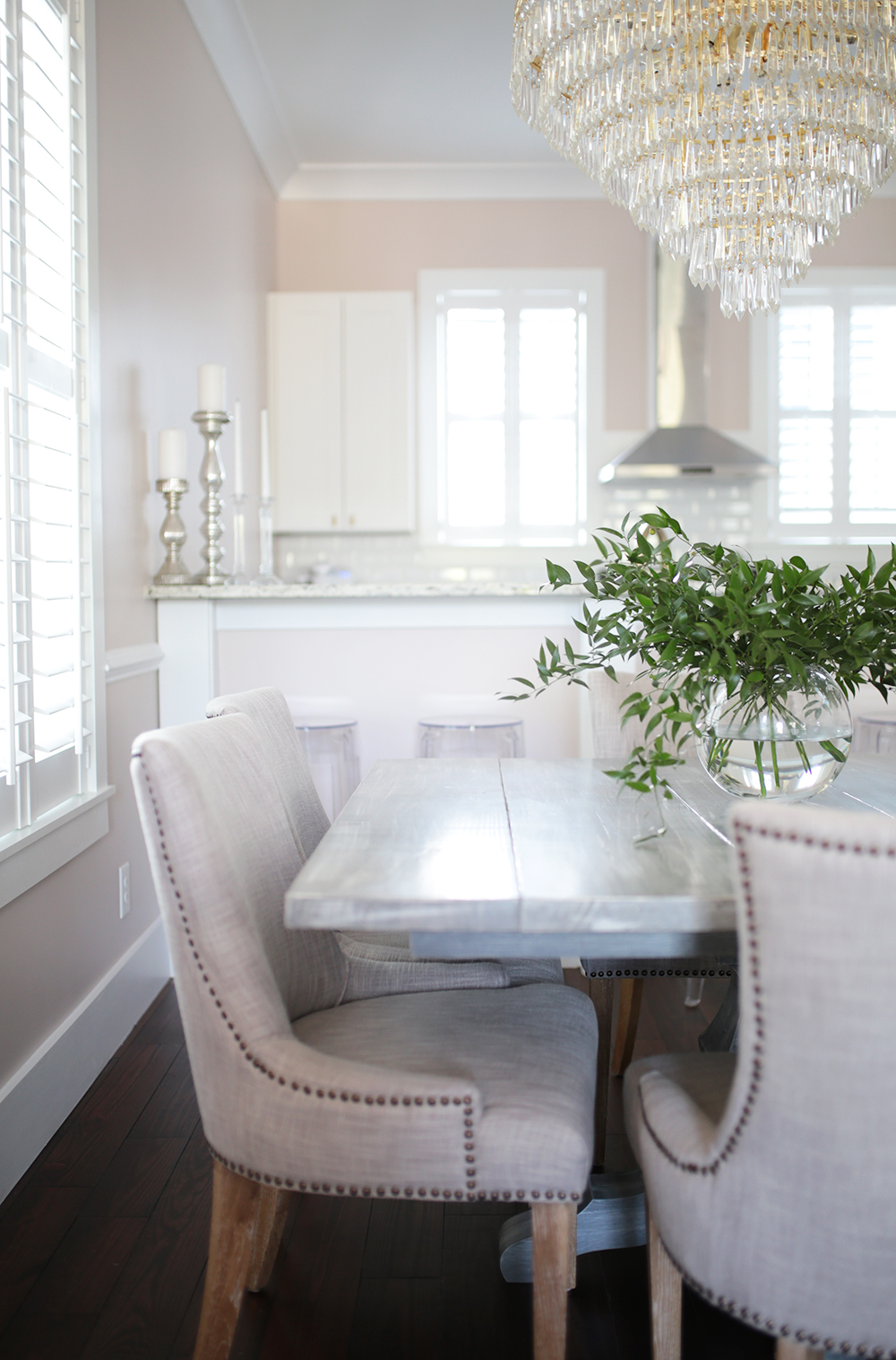
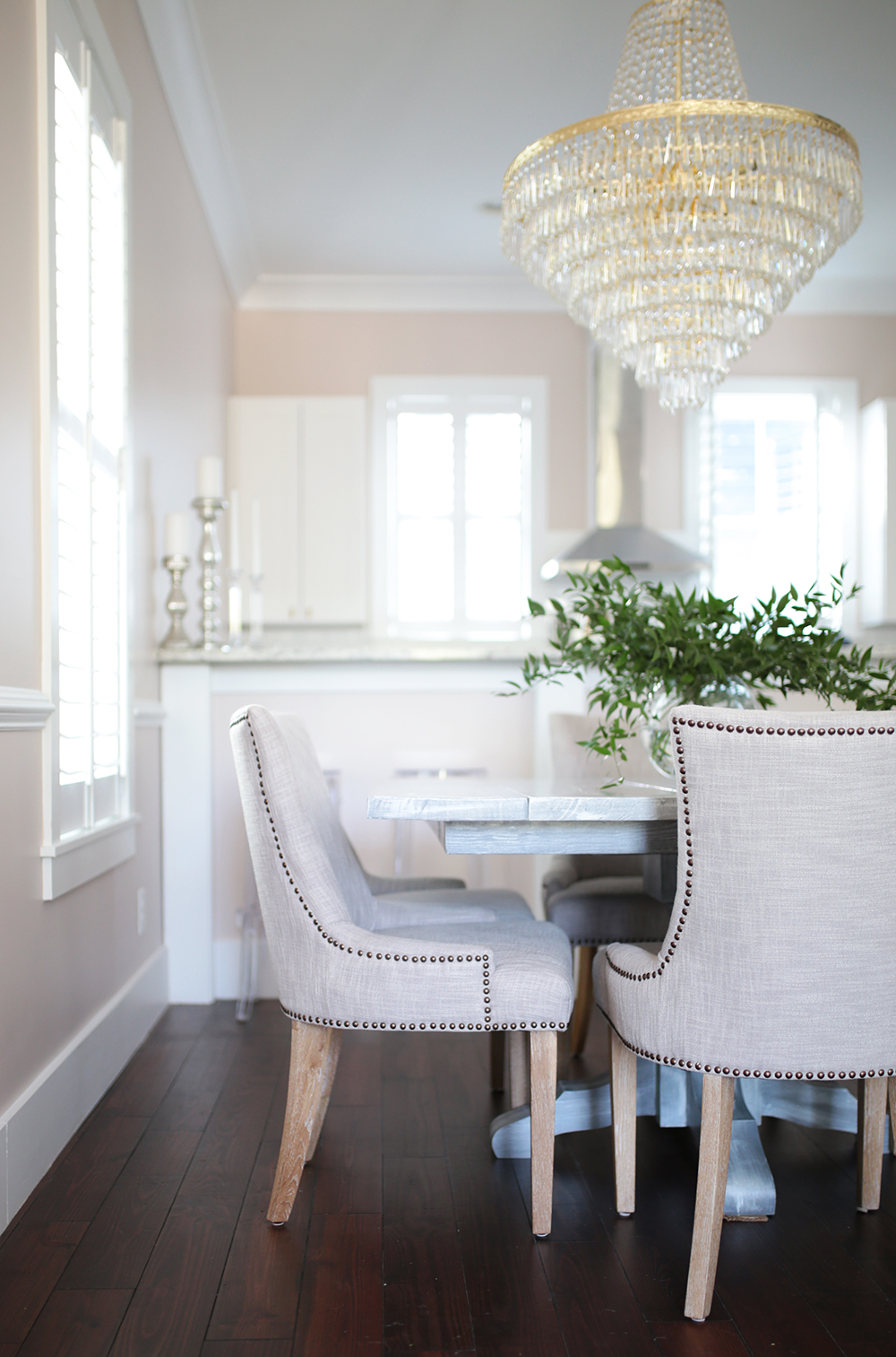
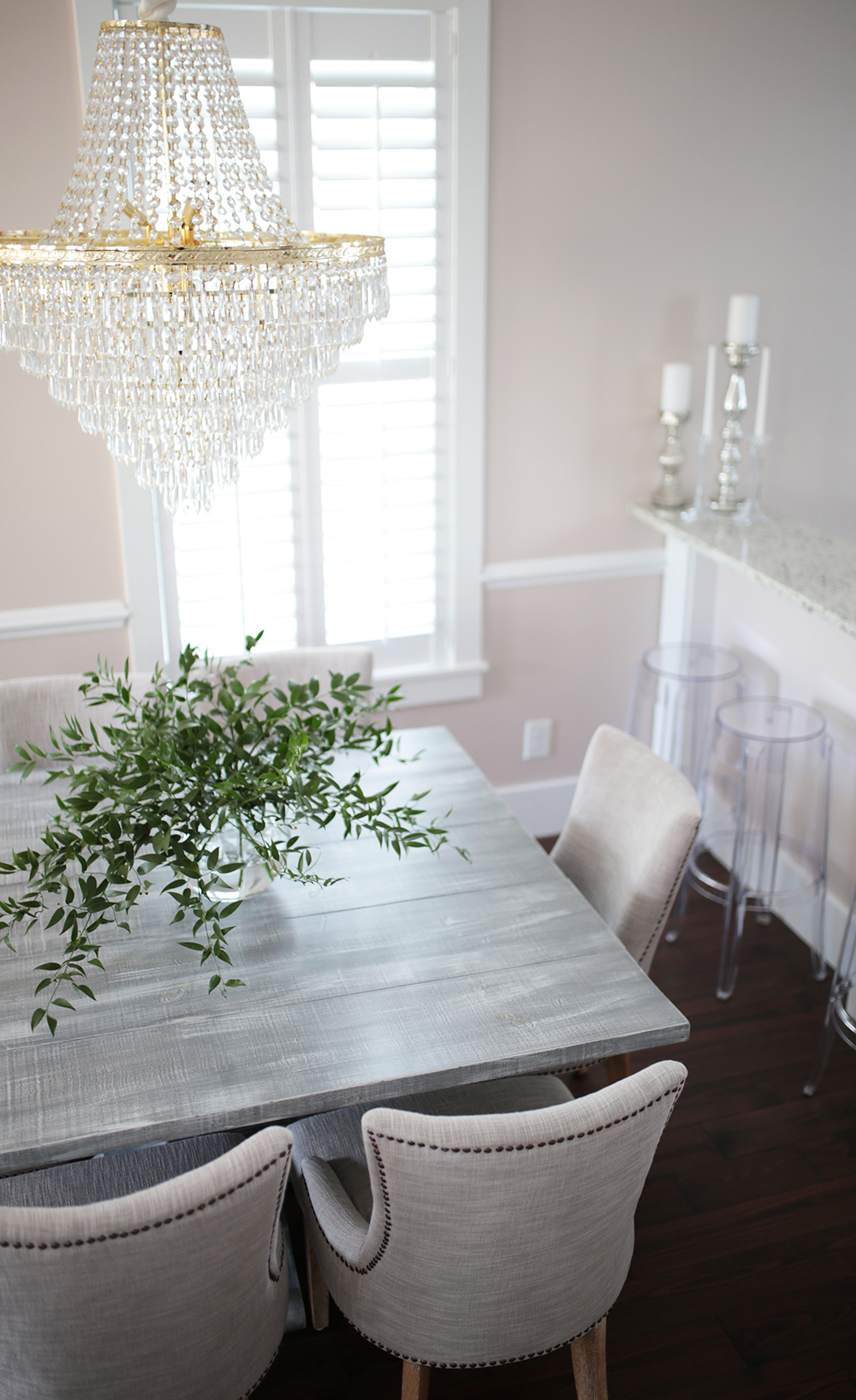
Once we had the paint color nailed down {phew}, we moved on to chair rail. I’ve always been a fan of chair rail. Even had it in my middle school + high school room, complete with yellow walls + stripe wallpaper I help my Mom hang. I originally wanted chair rail along with boxes underneath, but our contractor advised against it due to our window placement and lack of lower wall space. Ultimately it was the right call to just stick with the chair rail. It adds some interest to the 13 ft. walls and is actually useful! Did y’all know chair rail became a décor element out of practicality? Maybe that’s a no brainer, but I personally had no idea. It’s usually placed 3 ft. off the floor to protect the walls from chair damage at the dining room table. Ha, who know?
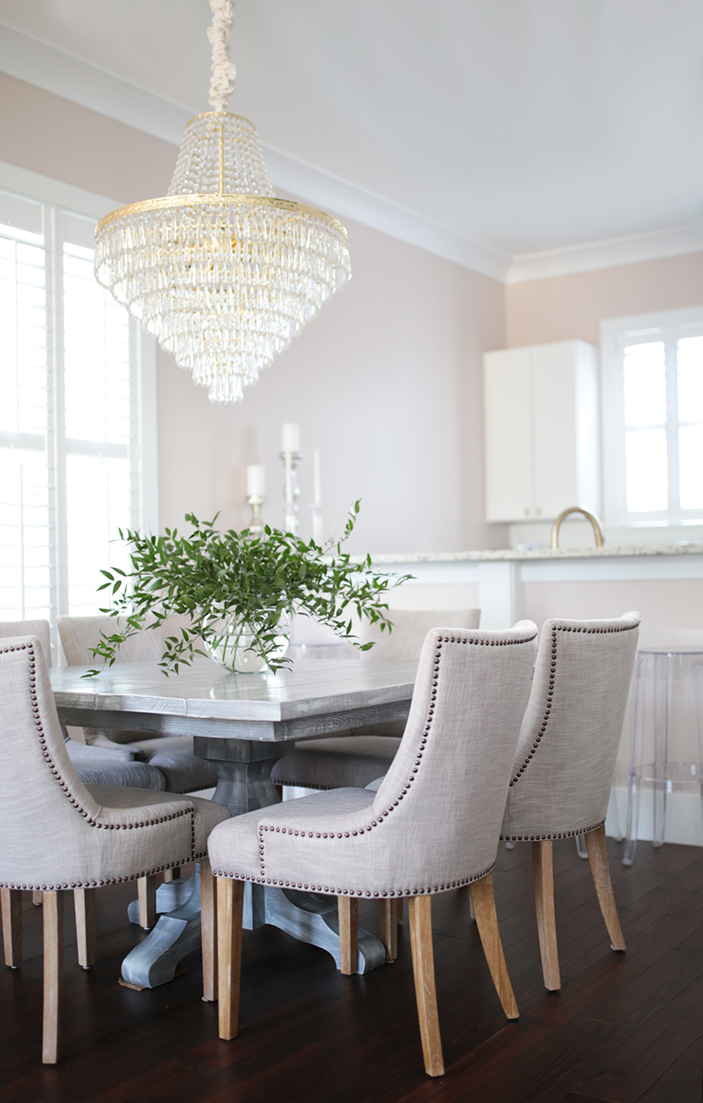
Table + Chairs.
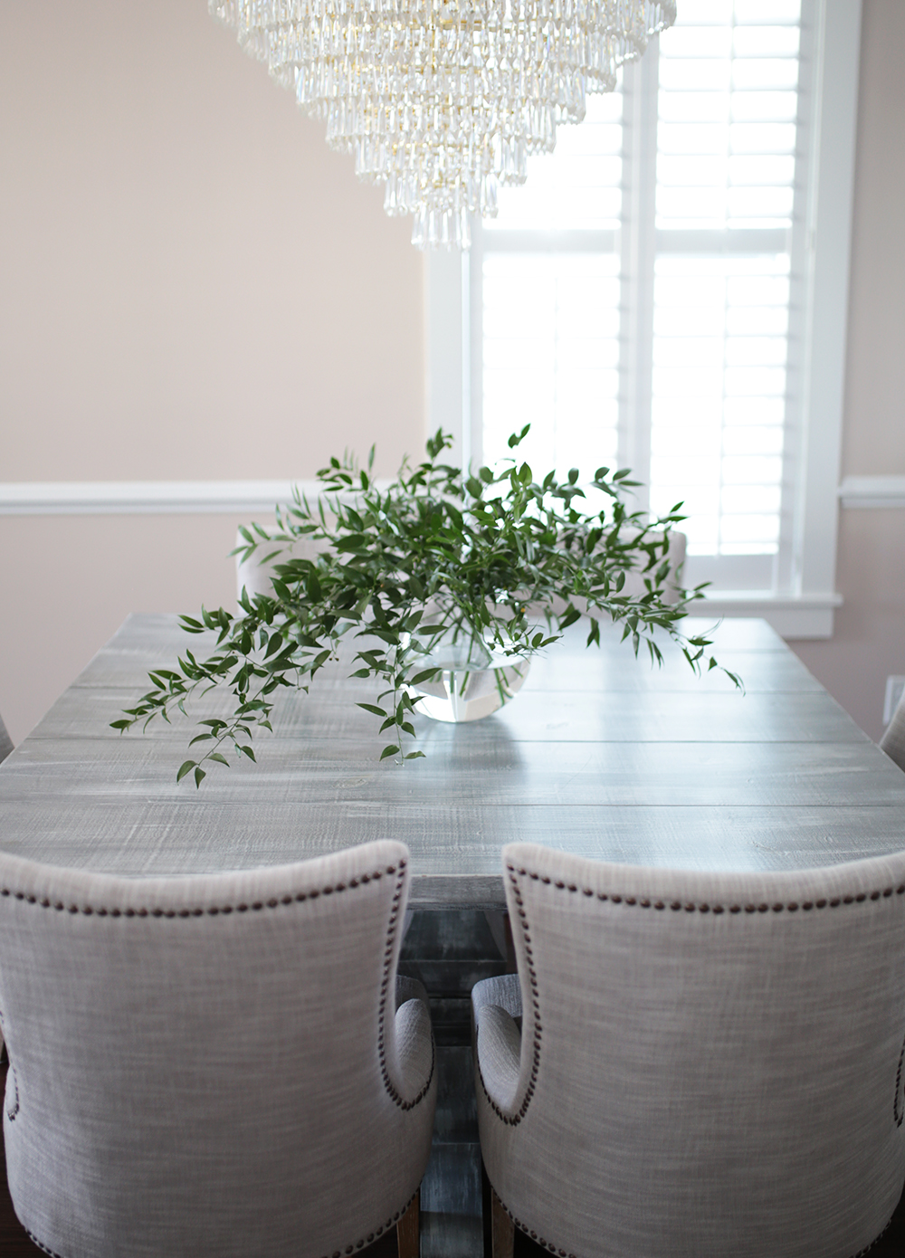
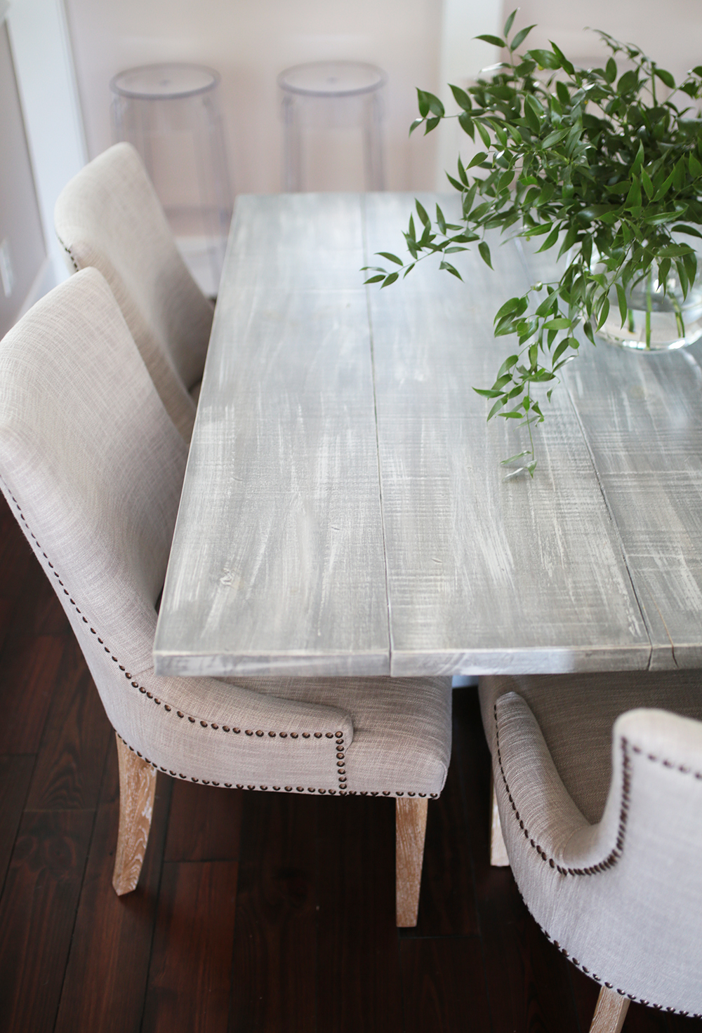
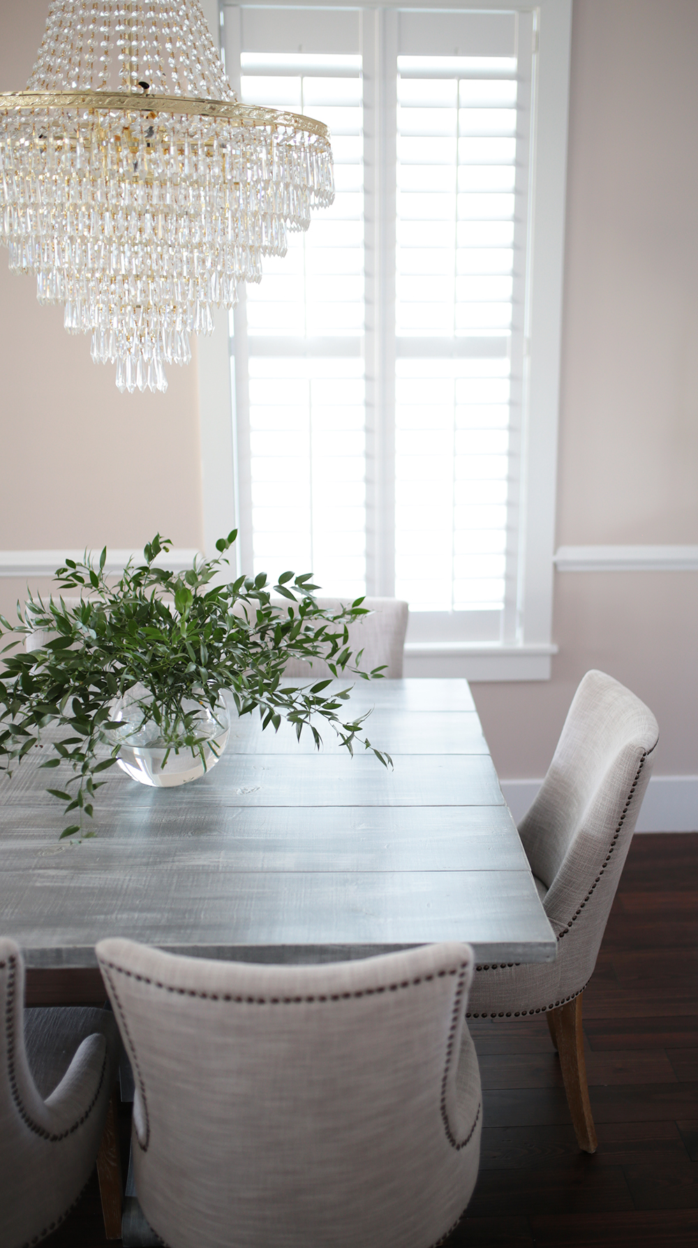
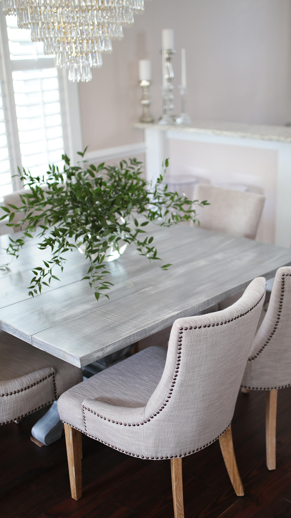
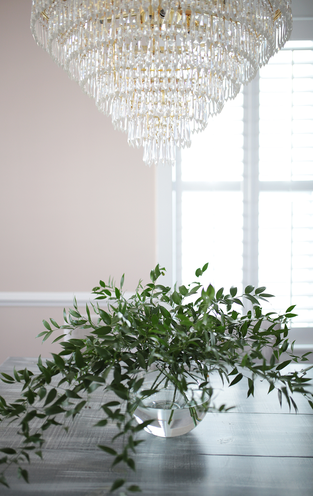
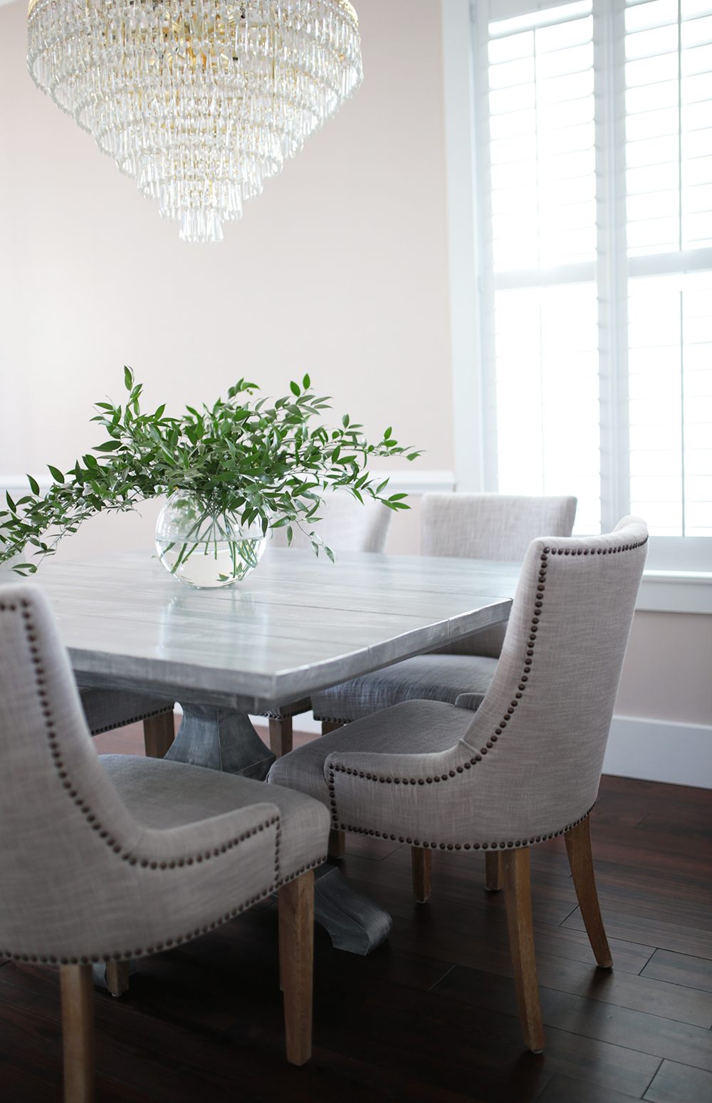
I went back and forth on this for a bit. I wasn’t sure if I wanted white wood, grey wood, natural wood, glass even – but ultimately decided on a grey white wash farmhouse style table. Lizz found an amazing local carpenter, The Salty Saw, who brought my vision to life better then I could have expected! Restoration Hardware’s farmhouse tables were a huge inspiration for our design. Particularly this French inspired center pedestal design. Given the layout of the space, we felt a square table was the best shape. Surprisingly, they’re aren’t too many square options available online or in stores! Hence why the custom option came into play.
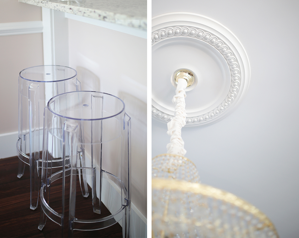
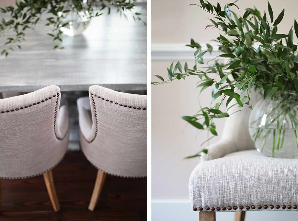
I’ve always been partial to upholstered dining chairs, so that was the route I knew we wanted to go. Lizz and I went back and forth with tufted vs non-tufted chairs, and ultimately went with these non-tufted beauties thanks to Joss & Main because I didn’t want the space to feel super formal. Having ample seating was really important to me. I love hosting people in our home, so having the max number of dining chairs + bar stools possible was key while designing our Farmhouse Glam Dining Room. The table measures 48 x 48, which actually seats 8, however once the chairs came in, we decided to keep 6 chairs at the table and keep the other 2 around the house so we can access when we need extra seating. The 8 chairs + 4 barstools, allows us to have TWELVE people in our little dining space! Success!
The Chandelier.
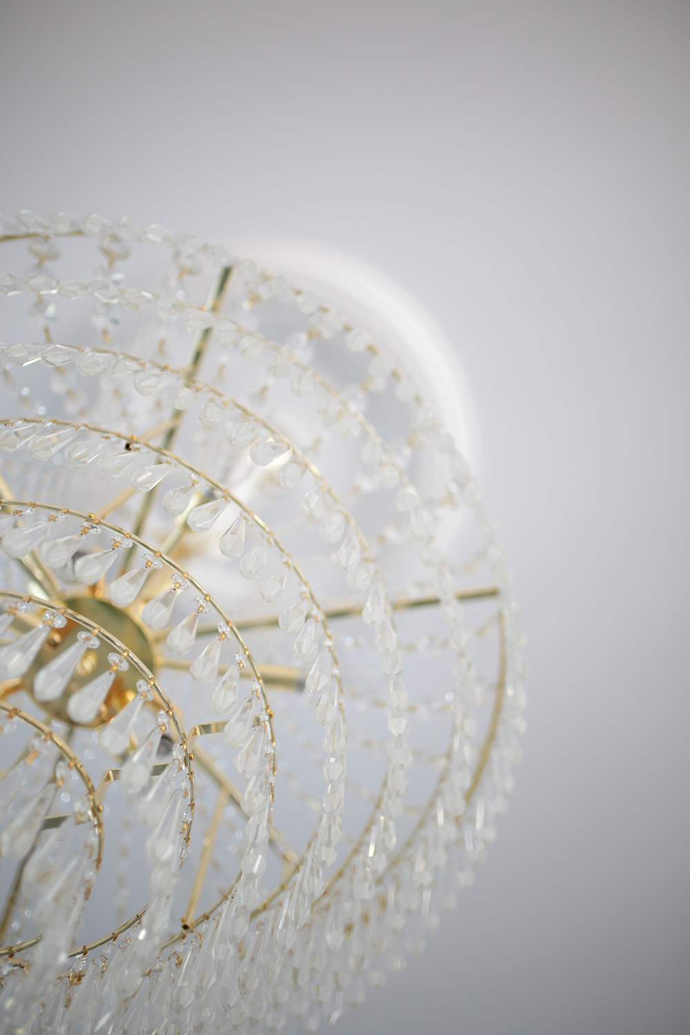
I knew I wanted the chandelier to ‘glam’ up the space. I wanted big, gold and sparkly. While my dream would have been to incorporate an antique crystal chandelier {totally swooned over all the ones we came across in Vienna}, that was out of the question budget wise. Maybe one day. Until then, I found this beautiful tiered chandelier that fit all the criteria I was looking for. I still plan on adding some patina to the golden hardware to age and soften it a bit.
And there you have it – it’s certainly still a work in progress, but what do y’all think!?
P.S. miss our previous home content?
Check out our Master Bedroom, Old Office #1, and Old Office #2.
 JavaScript is currently disabled in this browser. Reactivate it to view this content.