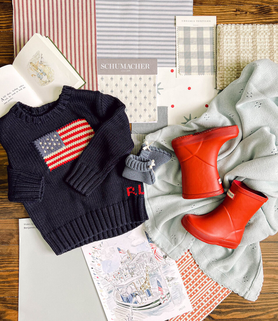
When I began scheming for out baby boy nursery, I was between two pretty distinct themes. On one hand I loved the idea of a Beatrix Potter themed space. Very English garden-esk inspired with rich toned wood pieces, alongside elements of hunter green, french blue and a little yellow. Maybe some sweet garden/veggie decor sprinkled in. And on the other, adored the idea of playing off the hallway bath color scheme. Which is a ‘shared’ bathroom for both upstairs rooms and blue + white with hints of red. Dare I say a very red, white + blue Americana-esk vibe.
The later was the clear winner as soon as I came across Sister Parish’s Serendipity print. When my creative juices really start flowing and it doesn’t feel forced is when I know I should follow my gut. I also loved how this is a space should be able to grow with him! The pattern isn’t too ‘baby’ and will transition nicely to a big boy room. Not to mention just the right amount of red in the perfect rich hue – chef’s kiss.
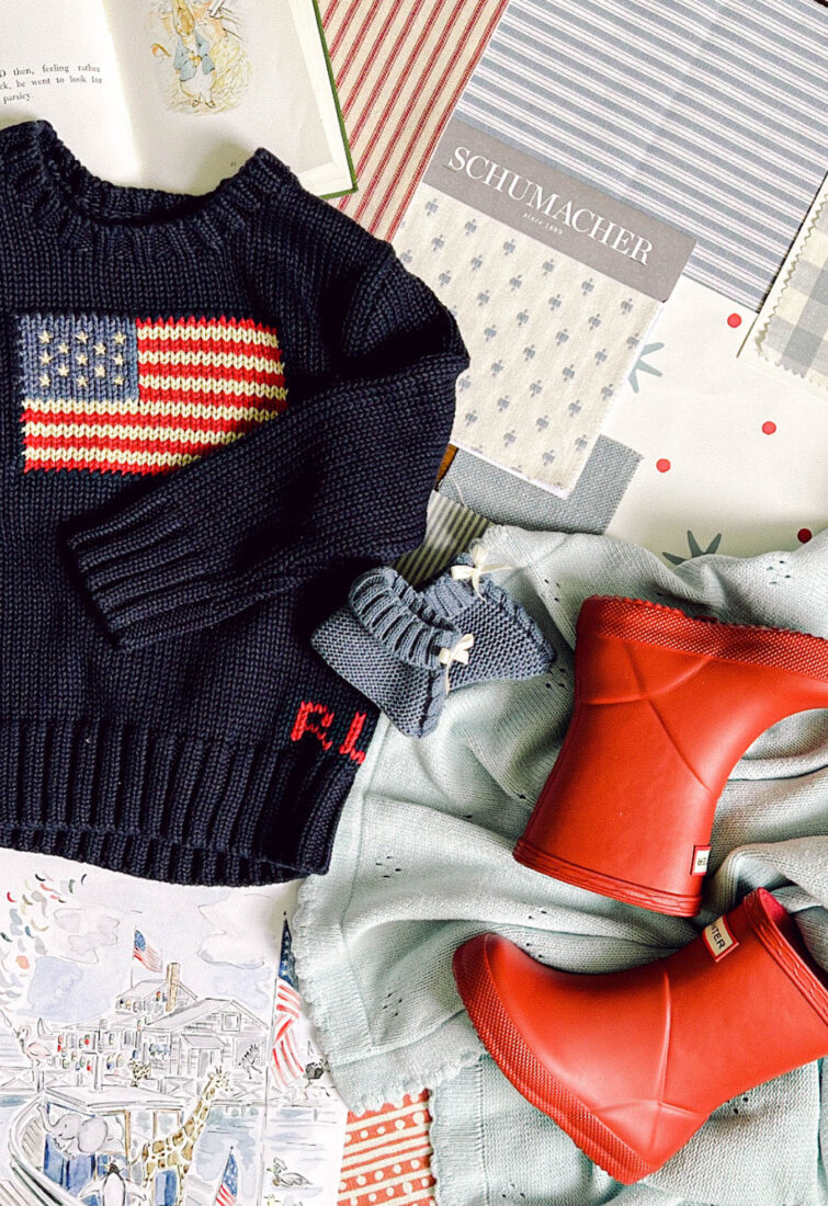
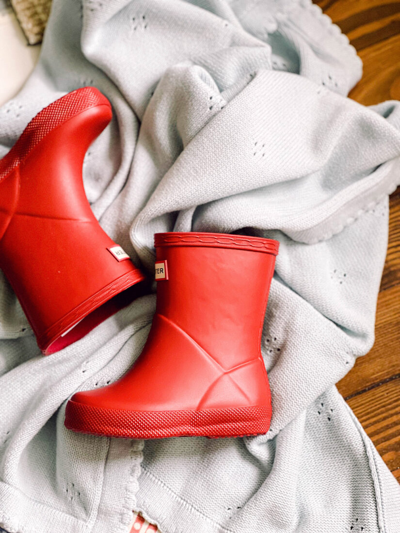

The Hero Pattern
As I began scheming for baby boy’s nursery, I quickly came across this darling star patterned paper by Sister Parish which turned into the launching point for the room. Yes, it’s been used in I’m sure countless nurseries, but I don’t even mind. I love it so much, and know it will be such a happy space for our sweet boy!
I debated doing the entire room vs. adding chair rail or moldings of some kind to break up the pattern. However, it’s a small repeat, therefore does’t seem overwhelming to be placed floor to ceiling in my opinion. Seen in this beautiful room Griffith Blythe Interiors and Boy’s Bathroom by Alexander Interiors. The room also already has multiple casings between 3 doors + 2 windows, so adding additional molding seems like it may be even choppier.

Painted Ceiling
To compliment the stars in the wallpaper, I thought it would be fun to paint the ceiling a soft hue of blue. Not an identical match, but something that would add a little more depth to the design. After comparing a few options, I settled on Farrow & Ball’s ‘Borrowed Blue’. It has a warm undertone, which I love and am really leaning into throughout the entire room.

Glider
Selecting a glider was the hardest part of the nursery. Mainly due to the lack of availability and customization options within a 6 month timeframe. Most upholstery manufacturers are still backlogged from Covid shutdowns, etc. so a lot of fully custom options wouldn’t ship for 12-18 months. Not super helpful when you have a pretty set timeline for baby!
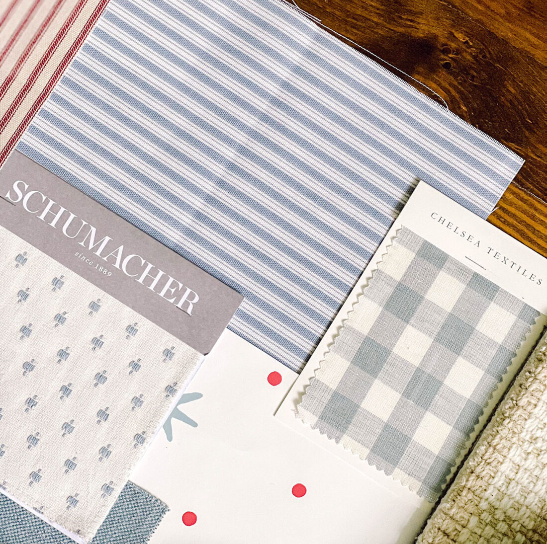
But I knew I wanted blue, with a contrast pipe if possible. And was heavily looking into simply purchasing a secondhand glider and getting it reupholstered, until I came across this sweet sky blue option! Immediately ordered swatch samples to confirm the hue would work well with Serendipity. It was a lovely match! The visible walnut base wouldn’t have been my first choice, but now it’s actually grown on me and I think will play nicely with some of the other warm wood elements in the room.
Furniture
I knew I wanted to incorporate a few antique elements in his room, and the dresser/changing table was the obvious first choice. Took me weeks of paroozing sites from FB Marketplace to Live Auctioneers, but finally came across a beautiful piece that had just been refinished + was perfectly sized for his nursery. You can see peeks of it here. Granted, it wasn’t super close by, but we were able to loop the pick-up in on the drive to pick-up Teddy! Ended up spending about 9 hours in the car, but was 100% worth it.
Was inspired by fellow interior enthusiasts Megan Runion + Pretty In The Pines to include some type of antique curio or display case in the nursery. Something to be both decorative, but practical and serve as a bookcase, area to house family photos, momentous and other sweet items. Was able to find + source just the right piece that brings a masculine touch to the room. Cannot wait to get to work styling both of these pieces and be able to share the full scope with y’all!
Artwork
I keep going back and forth on artwork for his room. I know there are so many opinions when it comes to artwork above a crib or changing table. The later of which is most likely going to be in front of a window in our home, so I don’t have to worry there. But the crib wall is pretty large, and I don’t want it to feel empty. I’ve contemplated framing vintage covers of Beatrix Potter books to have a little something on the walls. And have also been eyeing this sweet wicker hot air balloon to hang in a corner. But at the end of the day, I’m going to wait for the wallpaper to be installed and see how I feel. The paper may speak for itself, or it may seem like there’s a void that needs to be filled. Time will tell, but regardless I’m not stressed about it.
Can’t wait to see this baby boy nursery come together and share the full scope of the room with y’all! It’s truly the most excited I’ve ever been to see a room come together. And even though I know an infant’s level of appreciation is limited haha, I’ve pondered over every little detail. I just can’t wait to make memories with our little one here. To watch him sleep, read to him, have conversations with him. I already know it’s going to be the most magical spot in our home.


this post is a delightful and inspiring read for anyone interested in interior design and nursery decor. The author’s expertise and passion for design shine through in every detail, making this post a valuable resource for anyone looking to create a beautiful and functional space for their little one.
https://gocfabrics.com/store/