When we first moved into this new home {and even during the renovation process}, we knew the Blue + White Guest Room would become one of the first priorities to put together. It’s always been important to me that our family + friends feel at home and comfortable when visiting, even if it means taking comfort away from my own living/sleeping space. But in this case, we also knew the Guest Room would in fact be our primary bedroom initially. I’ve felt I needed more time to wrap my mind around what exactly I wanted for the Master Bedroom, and it’s been nice to space that out financially as well. But between focusing on the entire home renovation AND furnishing, and even some outdoor products…I’ve simply been ‘decision tapped out’ as I call it.
Blue + White Guest Room
Alas, decorating a Guest Room is always less pressure in my opinion. You can have fun with it, be playful and daring, without feeling like you’re stuck staring at it everyday if it doesn’t live up to your expectations. Or in my case – the expectations I have in my head haha. Even now, I absolutely LOVE our ‘escape inspired’ Blue + White guest room, but even as I look at these images now, I already see a few things I’d like to tweak. But that’s the fun of it, right?! You’re never really finished tinkering in your own home. And it’s much more interesting to see it come together over years of collecting, swapping furniture around, adding layers, etc.
From the initial inspiration and paint colors, I envisioned this space to be a little escape for guests. I wanted a tried and true Blue + White Guest Room, with nods of travel and vintage finds/feels mixed in here and there for some depth and contrast.
All Things Bed
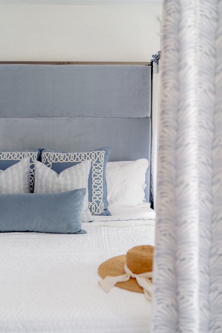
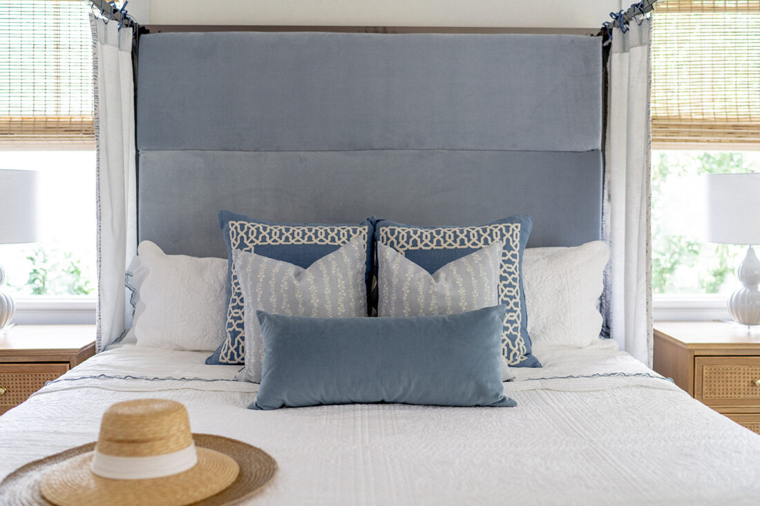
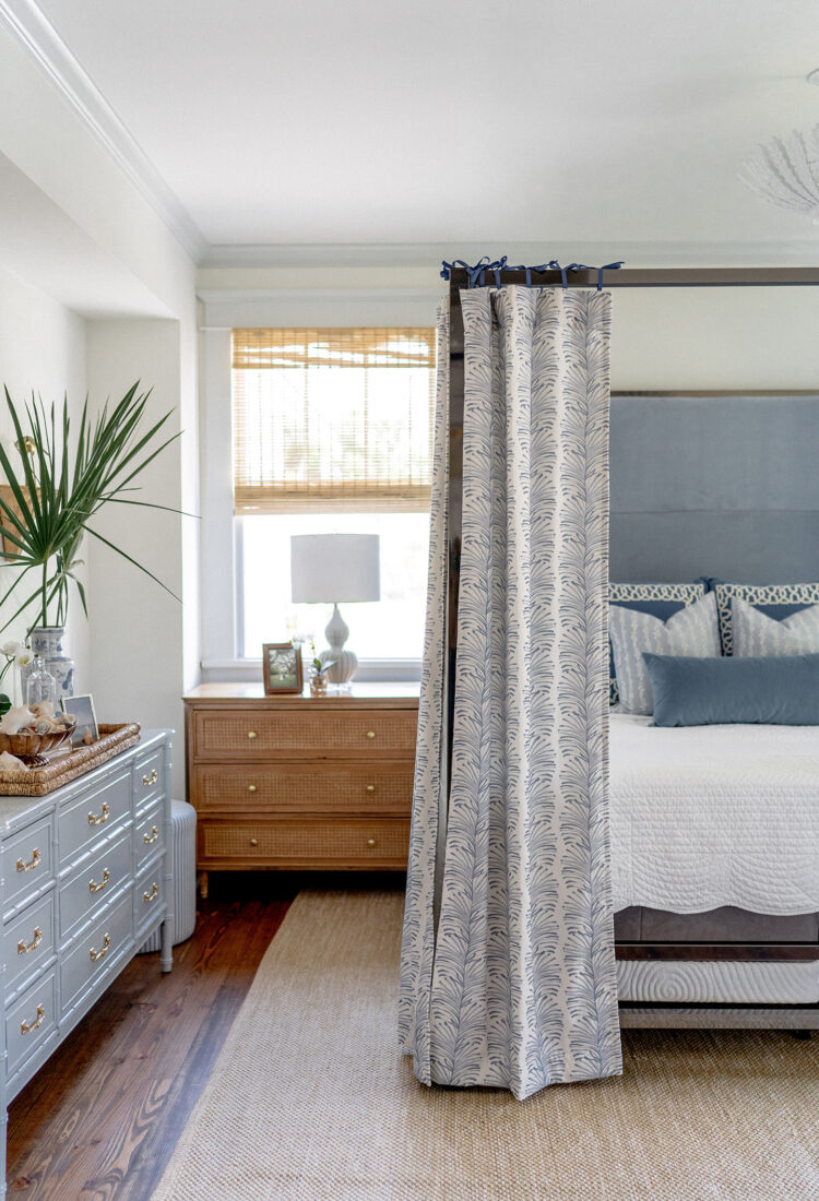
Let’s talk about the main focal point of this room room – the bed. Initially this was a very modern, minimalistic poster bed we purchased for the Master Bedroom of our previous home. We always loved the height and presence of the piece, but I never truly loved the headboard fabric or surrounding elements. After countless hours researching beds, gathering inspiration, debating selling/buying a new one, etc. I was inspired to keep him and make him new again. Inspired by a few Designers I came across, but mainly this incredibly beautiful room by Becky Nielsen Interiors. I loved the way the fabric panels softened the frame, while adding some personality and pattern to the space. And felt it was an attainable route/project I could execute on my own.
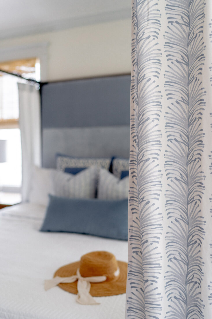
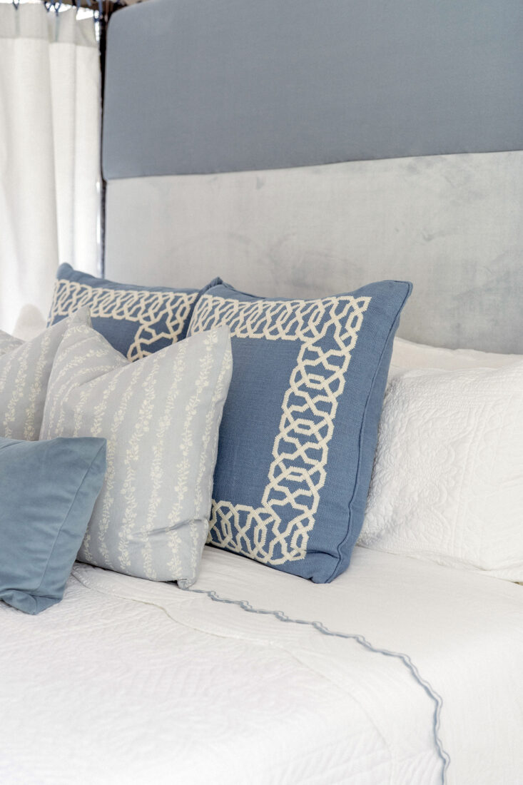
Enter Pepper! Pepper Home is an online, direct to consumer resource that offers an incredible selection of really fun, fresh patterns you don’t see everywhere. At an affordable price point no less! I feel their fabrics can mesh well with any decor esthetic; from modern to traditional and everything in between. When I came across the Emma Sky, I knew we were headed in the right direction. It was everything this Blue + White guest room needed. I worked directly with the Pepper team to customize the panel length + width to suite the bed, and attached them simply by hand tying a little french blue gross grain ribbon to the hooks. I also had a local seamstress assist with recovering the 3 headboard panels in Sky Velvet fabric – also by Pepper. The original material was a dark grey, and the blue really lighted the space and brought it all together. Success!
The only thing I will note about these curtains, as seen in some images, they are not double sided. Which is of course preferred {and common} for actual window treatments. However, it may not be considered ideal for this type of application since you can see the white lining and hooks on the inside. I’m still trying to figure out a method to at least cover the hooks {the white lining doesn’t bother me personally}. But thinking of maybe adding an additional band of fabric across the top to at least cover the hooks. Minor detail. Overall, I absolutely adore how this came together!! It softens the bed, while adding a touch of whimsy to the room that so fun for guests.
Bedding
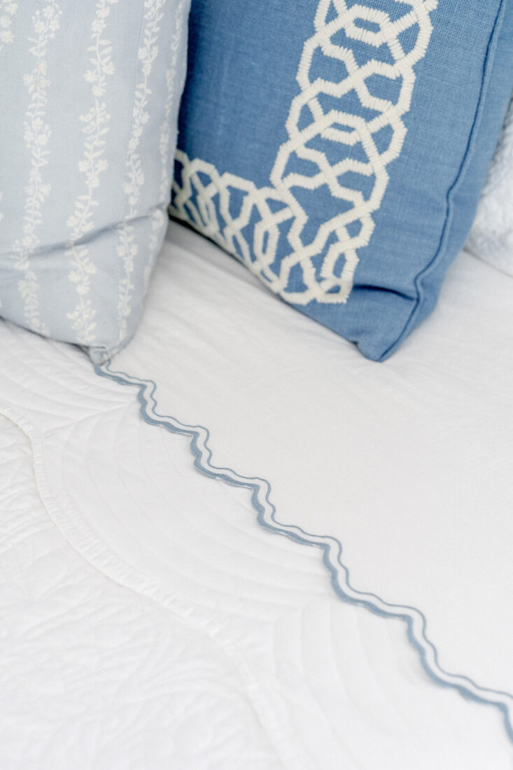
Our current bedding is a little mix of older items we’re had and continue to love on, along with a few new additions. Like this affordable scalloped edge quilt/sham set + blue embroidered sheets. The blue euro shams are by Serena & Lilly, followed by decorative throws by Brooke + Lou and lumber via The Inside in ‘ocean velvet’.
Dresser Vignette
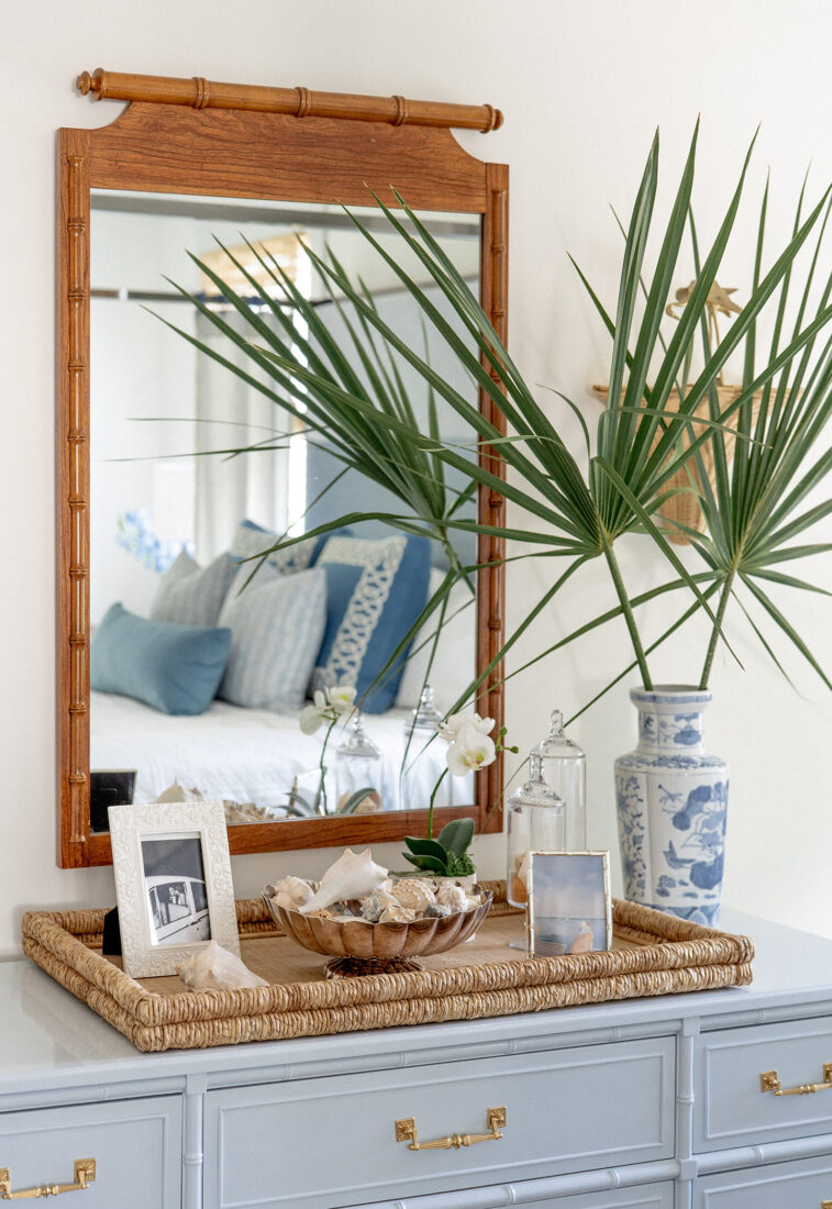
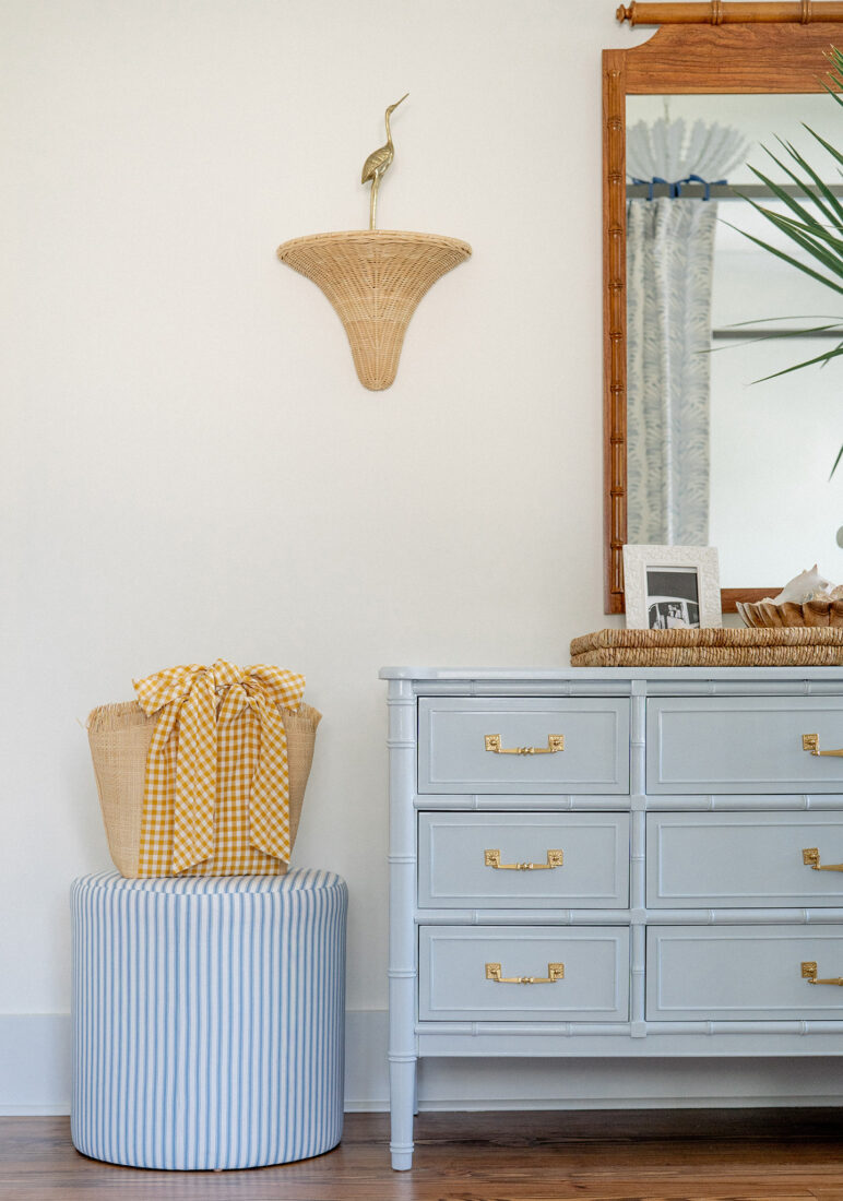
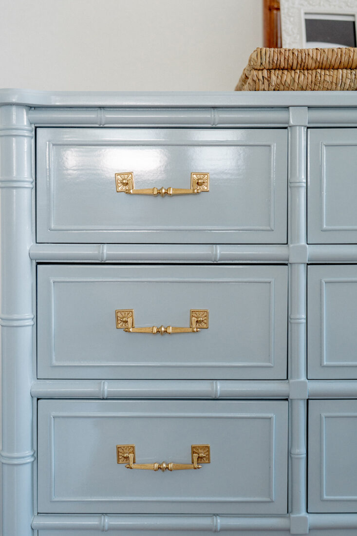
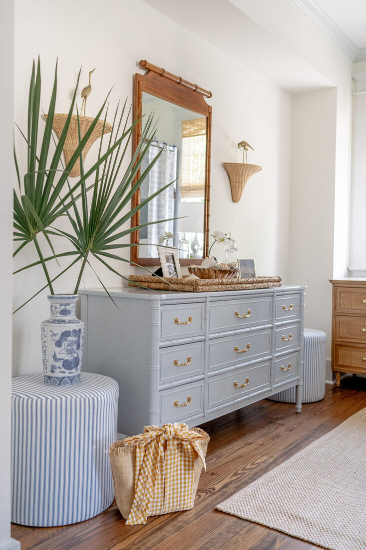
I was beyond thrilled to get my hands on this vintage Henry Link dresser through One of a Find. Their pieces often sell in seconds, so you have to act quickly! While I actually really do love the natural color of this furniture, I wanted a little pop in this room to offset the white walls + soft trim. So I opted to have it lacquered in Benjamin Moore ‘Silver Mist’. Absolutely love the finish and feel it brings to the room. Grounded the blue dresser with a warm toned, contrasting vintage Bamboo style mirror found on Etsy, along with this woven tray, sea shells collected from travels and a scalloped silver bowl.
The Dresser is flanked by striped drum ottomans via The Inside. Along with beautiful rattan wall sconces that were kindly gifted by Amanda Lindroth. I styled them with a pair of antique brass birds, while I’m still on the hunt for the perfect set of foo dogs.
Seating Corner
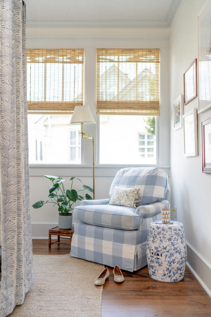
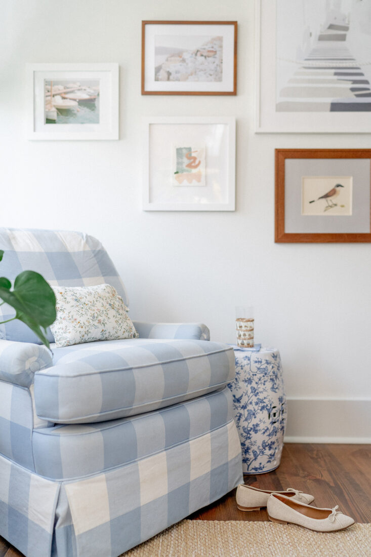
I was lucky enough to score this darling {and dare I say perfect!} gingham swivel chair from Sole Society on FB Marketplace! The listing popped up one evening, and the seller was a gal I knew in town -Mimi from The Tiny Tassel! I messaged her immediately and scooped it the next morning. Could not be more thrilled. She’s accompanied by a small floral pillow from Parterre, garden stool and vintage bamboo plant stand. The gallery wall is full of photographs from our travels, a couple originals by Kathleen Jones and a few antique shop finds.
Bamboo Shades
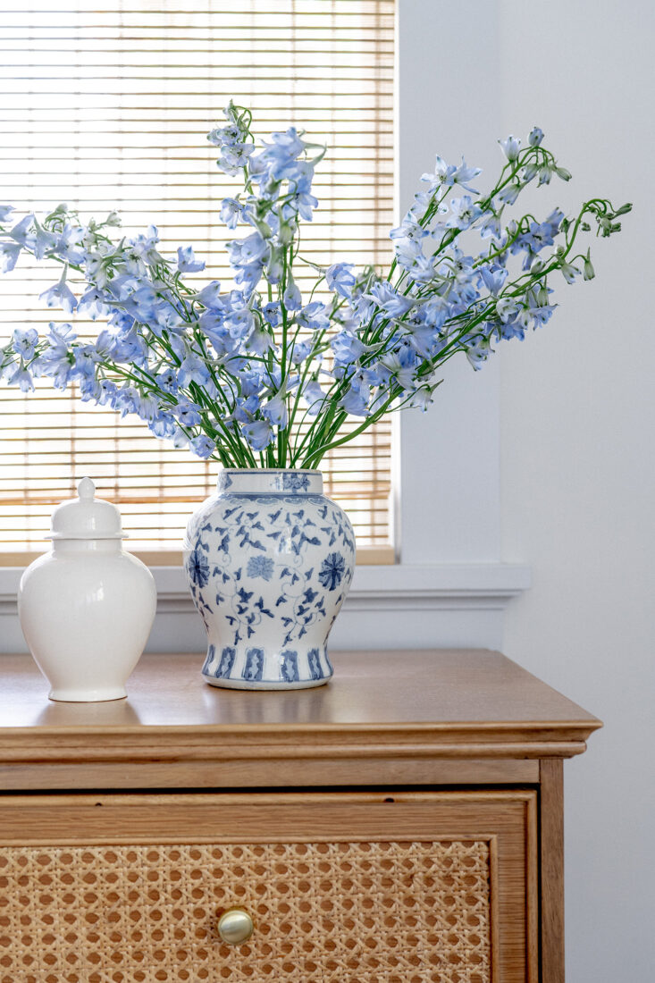
Was introduced to these incredibly affordable window shade options by fellow interior decor lover – Cynthia Ruff. She also turned me onto BoutiqueRugs.com where I sourced our breakfast nook rug. So I trust her judgement and finds on affordable home options. These shades were exactly what I wanted for this room. Due to the odd window placement, multiple windows dead-end into wall corners, making it near impossible {or practical} for draperies. So I knew romans would be my best option.
These bamboo shades come in multiple lengths, and SO MANY widths {also available on Amazon}, which made it really easy to outfit the entire room + bathroom in one sweep. Are they perfect, no. But they’re around $50/each, so I’m not complaining. They’re functional and still let in a good amount of sunlight even when closed. One thing to note – the backs of these shades aren’t the prettiest. You can see the vertical chain lines from outside the home. However this room is in the back of the house, on the second floor, so it doesn’t bother me. But I would not suggest using these in a primary space facing the street. Or an area you’re looking for uniformity in your window treatments.
Additional Sources
- Rug | is a soft cotton weave gifted by Rugsusa.com. It’s provided a great, neutral base for this space. I’d highly recommend! Lots of in-stock options and quick ship.
- Nighstands | we’ve had for several years; originally from One Kings Lane x Bed Bath & Beyond Collection {similar here + here}
- Plaster Ceiling Fixture | via Circa Lighting brought over from our previous home
- Floor Lamp | via Circa Lighting
- Table Lamps | via Homegoods – still on the hunt for upgraded shades!
Photos by Marni Rothschild Durlach
I was worked with Pepper Home, Circa Lighting, Rugsusa.com and Amanda Lindroth who generously provided discounted and/or gifted product for this space.


So pretty! Do you have a source for your blue painted chest/local charleston artist who can lacquer furniture?
This piece was done through One of a Find Charleston – she has recently transitioned away from lacquering unfortunately!
Hi, i’ve looked everywhere for the woven sconce shelves you have that are displaying the bird statues- and cant find!
They’re by Amanda Lindroth!
So gorgeous, I’m swooning!