
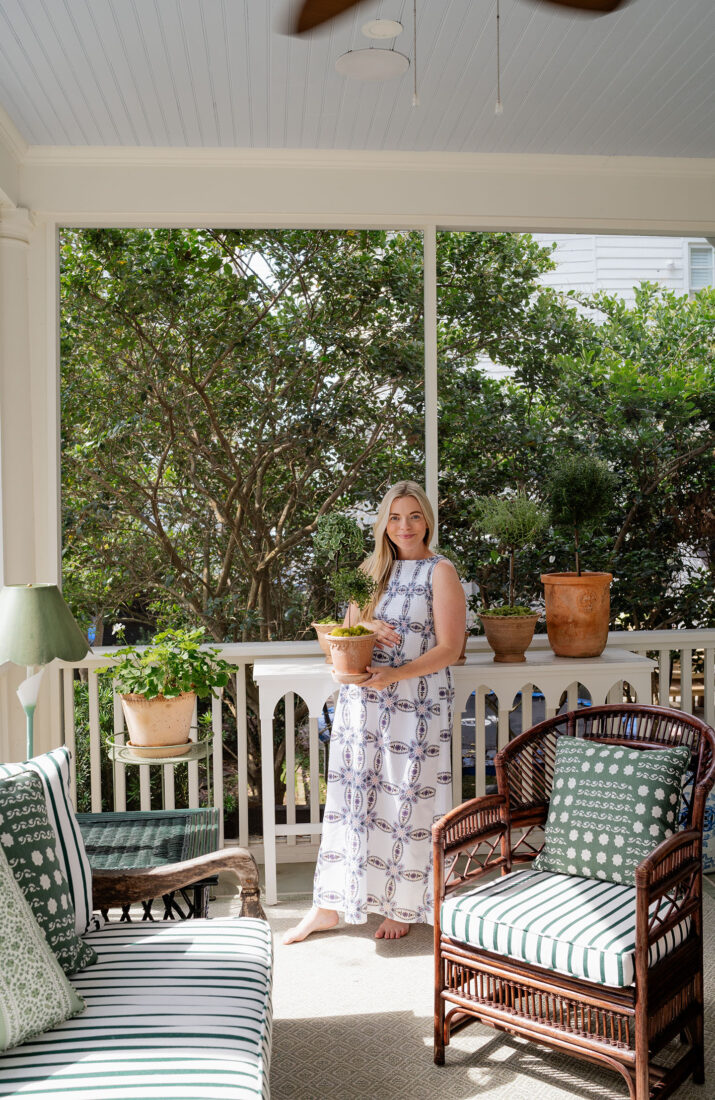
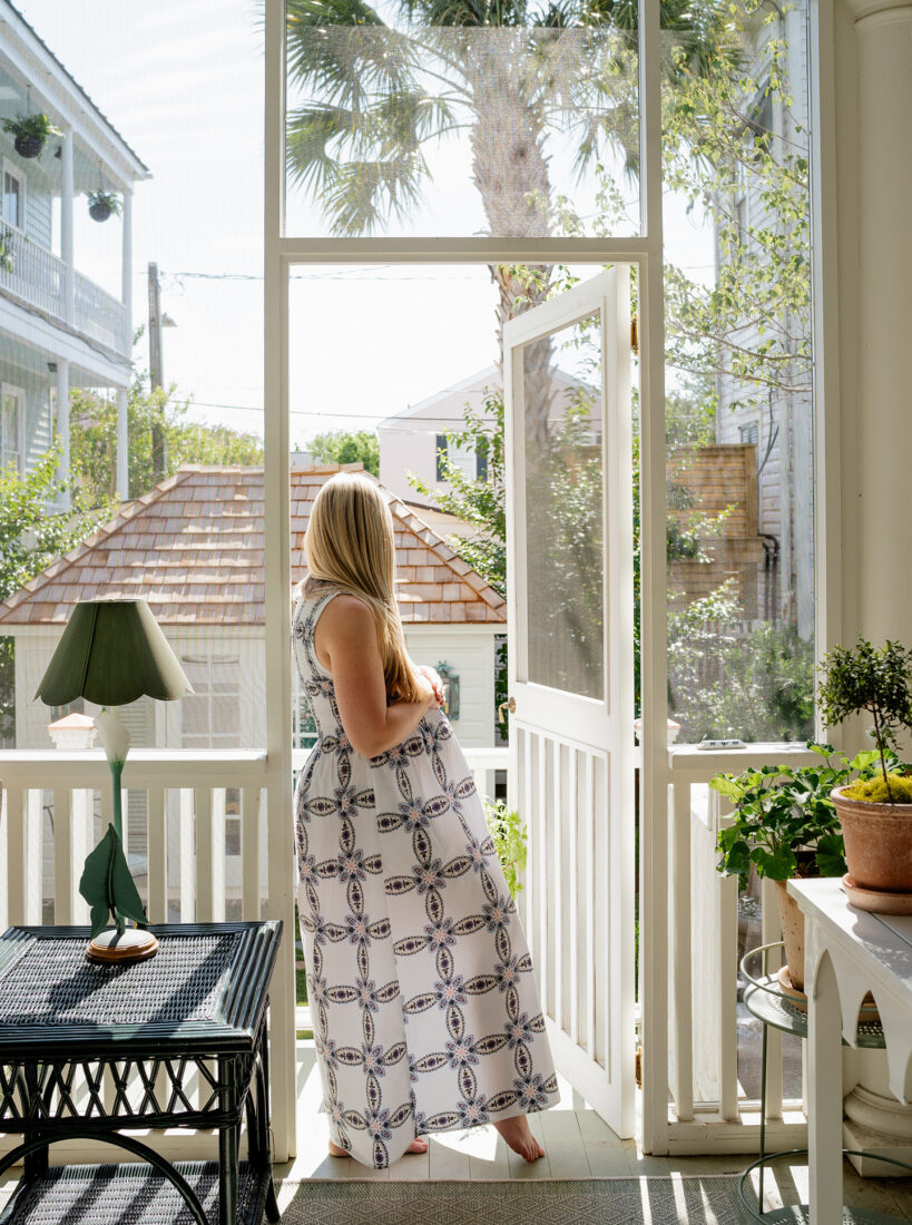
A space we frequently use in our home is the screened in porch. It’s one of my favorite spaces in the entire home, so when I started designing it, I wanted it to feel like an actual room with layers, rather than just an outdoor afterthought. Something that felt like a clear extension of our home. A space where we could relax as a family, watch TV, enjoy a meal or spritz on the couch and sink into comfy pillows. With a mix of old + new, we created just that.
Color Palette + Paint
After we had the porch re-framed + re-screened to make it more sound and tie in with the existing circular column elements, paint was the first step to getting this space ready for use. As mentioned, I wanted this space to truly feel like an extension of our home and existing rooms. The screened in porch is just off our Green Family Room, which already boasts layers of green hues. In keeping with that color palette, we decided the first step was painting the deck yet another beautiful green hue – Louisberg Green by Benjamin Moore. It’s such a rich and verdant hue, and really grounds the space in tradition while complementing the natural surroundings. Then opted to keep the floor cohesive, but with some added texture from this similar toned Sage Green Rug. The combination created such a cozy, soft base for the space and lots of room to layer in other colors + textures.
We topped off our paint selections with White Dove for all the trim and exterior house color. And above, the ceiling adorned in traditional Haint Blue – a soft, pale blue believed to ward off spirits and insects; adds a serene ambiance and a nod to local folklore.
Furniture Selection: Antique, Vintage + New
The biggest thing I initially struggled with on this porch was finding a good piece to serve as an anchor. I went back and forth on a sectional or sofa, and just when I thought I had decided on this stunning wicker Frontage sofa, I stumbled across something even BETTER! An antique teak, deep-seat bench from a local shop we adore – Elizabeth Stuart Design. The owner, Muffy, does an incredible job sourcing special pieces from around the world – and this piece was no different. I love the age and patina, and overall depth it brings to the space.
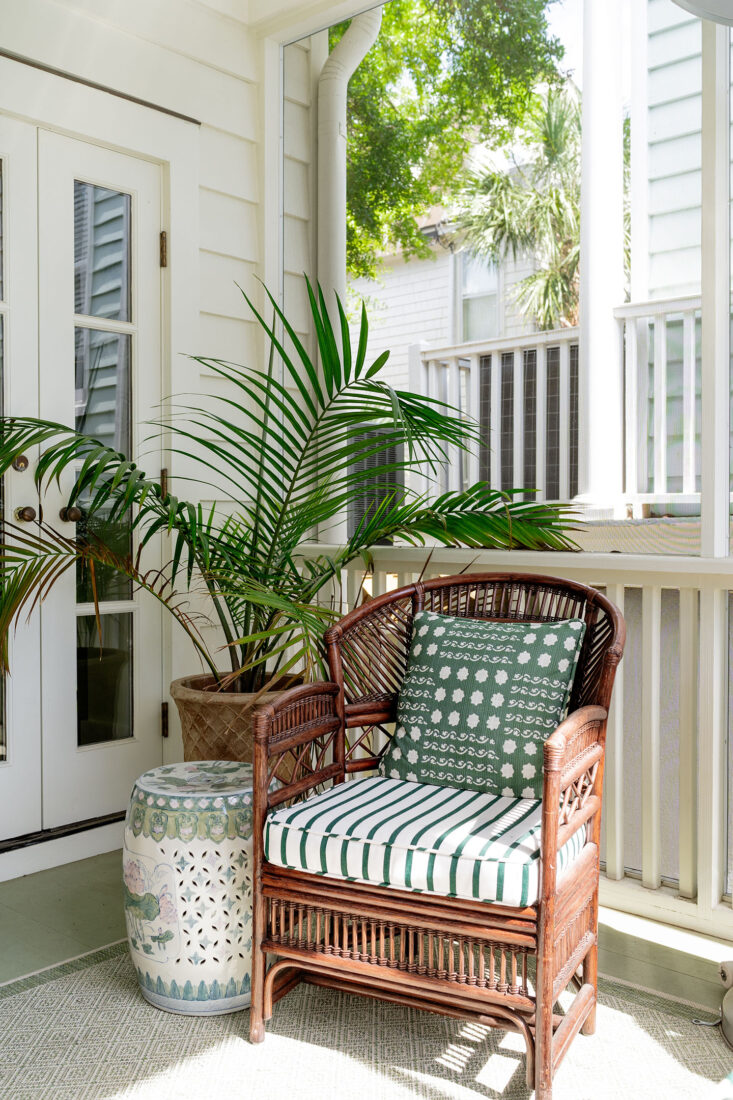
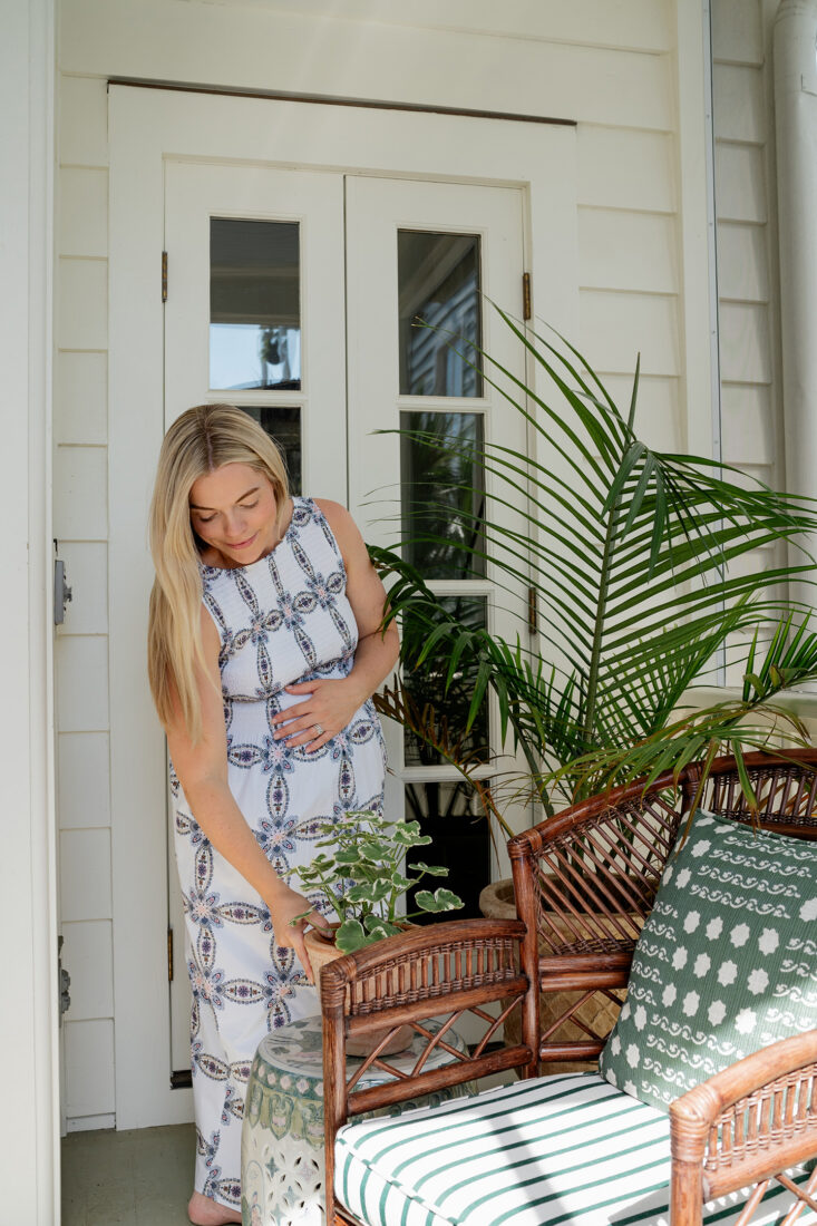
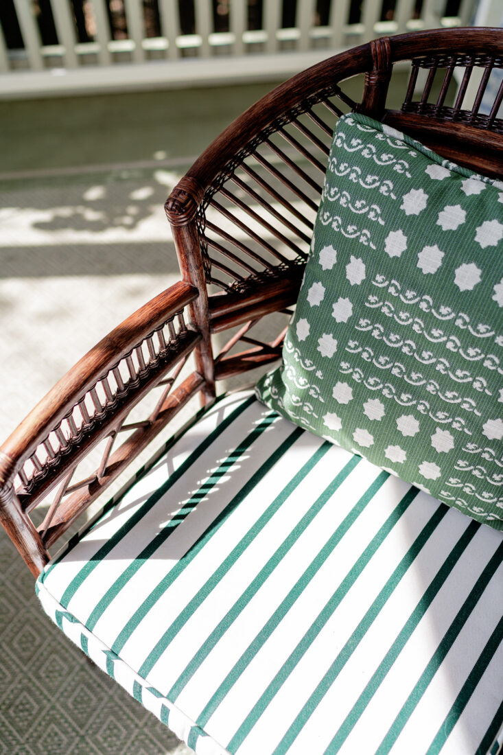
These Vintage Brighton Pavilion Chinese Bamboo chairs were an incredible estate sale find, but I’ve located similar styles below.

A variety of consoles, side tables and stools really help the space feel collected and layered to me. I had had my eye on this stunningly beautiful outdoor console by Oomph Home for quite some time, and love how it compliments our simple spindle porch design. The scalloped edge adds just the right touch of thoughtfulness, and the durably will mean this piece will be with our family for years to come. Side Note – Oomph Home’s Outdoor Collection is currently 50% OFF – run, don’t walk!!!
It wouldn’t be a Lowcountry Porch in the south without some woven elements as well, and this Outdoor Woven Scalloped Console by Mainly Baskets added just that. In addition, I sourced these incredible vintage wicker + bamboo painted side tables in a spruce green from another local collector, Ellie Proctor Antiques. I still can not get over how the rich hue perfectly plays off of some of our textiles selections for the space (more on that in a minute). At times, I’ll admit, have felt that maybe I went too far with all of the different textures and colors (nothing really repeats itself within the room), but somehow it all works together seamlessly and just feels right for this home. I adore the mix of old + new, and at the end of the day, these pieces are petite enough to switch around and shift to other rooms down the road as well. Which is always something I like to keep in mind when investing in furniture – it’s versatility.
Pots + Planters
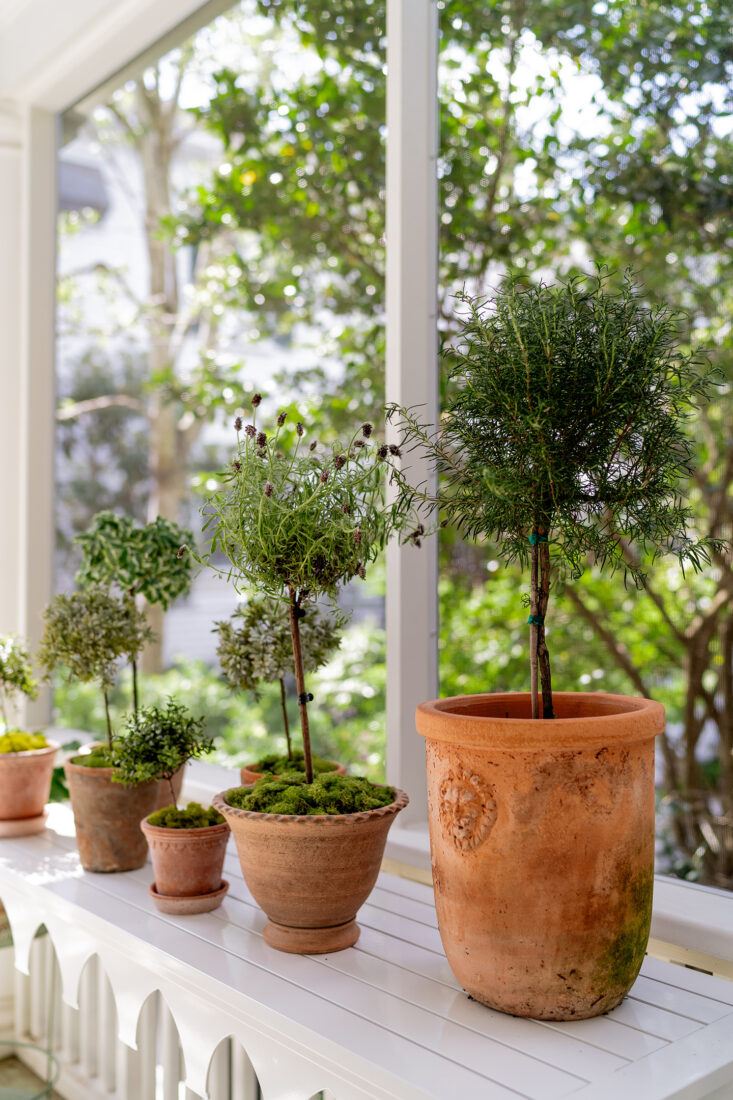
While our historic Charleston screened in porch is surrounded by beautiful, native landscaping, I love bringing a few seasonal + evergreen plants directly onto the porch. Never too much green in my book. This console serves as the perfect spot for potted topiaries when we’re not using it to entertain. I love the mix of Bergs and other terra cotta pots for added warmth. I’m often looking for pots + planters with unique details: a scalloped edge, wavy rim or lion head medallion to name a few. Again, it’s just those little details that truly make the space feel collected.
I typically try to support local when sourcing for fun planters, plants + topiaries, but have also purchased from this farm on Etsy several times when I’m out of luck locally. Linking a few great pot resources below as well!
Textiles
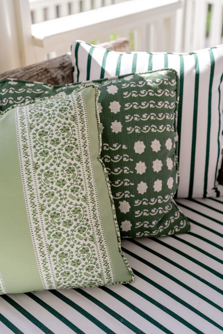
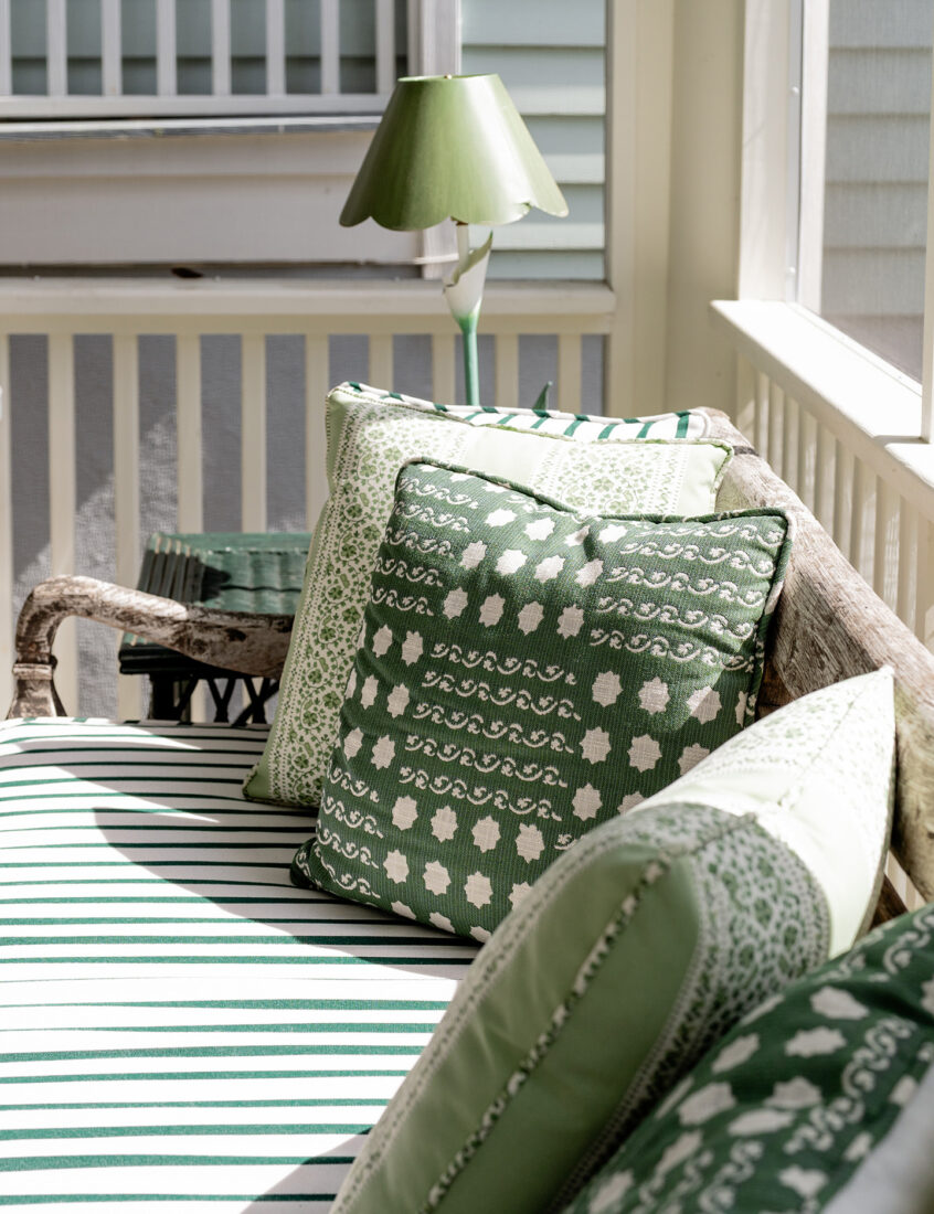
CUSHIONS: The textiles seen throughout our Historic Charleston screened in porch were carefully curated to add warmth + personality to the space. But it was important to me that all the fabrics we used were in fact indoor/outdoor or performance. I’m typically not one to be too fussy about ‘everything performance’. I appreciate a well lived in home that tells those stories of spilled milk and sticky fingers. But when it comes to the harsh elements of Charleston’s weather patterns – durability is key in an outdoor space.
Initially, I was drawn to this incredible Schumacher Jasmine print that incorporates sage and bits of a richer, spruce green. I knew I wanted to incorporate this print in some way, but went back and forth on making it the hero fabric with bench + chair cushions or pillow accents. Ultimately it was cost savings that led me to utilizing Sunbrella’s Lido Stripe in Botanical (originally sourced by the yard from Serena & Lily) for base cushions along the teak bench and bamboo chairs. It’s been several months since we’ve had them installed, and I can say I couldn’t be happier with the quality and performance aspect. Sunbrella just gets in right when it comes to outdoor fabric – you can’t go wrong.
PILLOWS: Sister Parish boasts one of the most fun-filled performance fabric selections, so I was naturally drawn to their options when piecing together textiles that complimented one another. Ultimately landed on Campobello in Spruce by Sister Parish for a touch of fun. Alongside Schumacher’s Jasmine in Green Leaf to really tie together the sage + spruce throughout. We also used this print on two chairs in the backyard that are visible from the screened in porch, so that’s a nice additional tie in.
Up next…I’ll be sharing the complete transformation of our garden.
Photos by Marni Rothschild Durlach
My goodness this is lovely!! Your attention to detail is so finely tuned-I appreciate seeing how seamlessly you’ve pulled all these pieces together. We are currently working on redoing our front porch and have also picked Louisberg green for our front door! We are trying to pick out a haint blue for our porch ceiling and have been considering Piazza blue from the Colors of Historic Charleston palette but still debating. Do you remember which color you used for your haint blue? Thank you!
Hi Marisa – thank you so much for your kind words! Ugh, unfortunately the exact haint blue we used is slipping my mind. You can’t go wrong with the Historic Charleston palette options though!