The kitchen is naturally what most would consider the heart of the home. It’s where you most likely spend the majority of your time. It’s where you entertain friends, make memories with family, and start your day literally every single morning with a cup of caffeine {or at least that’s what my morning routine looks like}. Bottom line – it’s important.
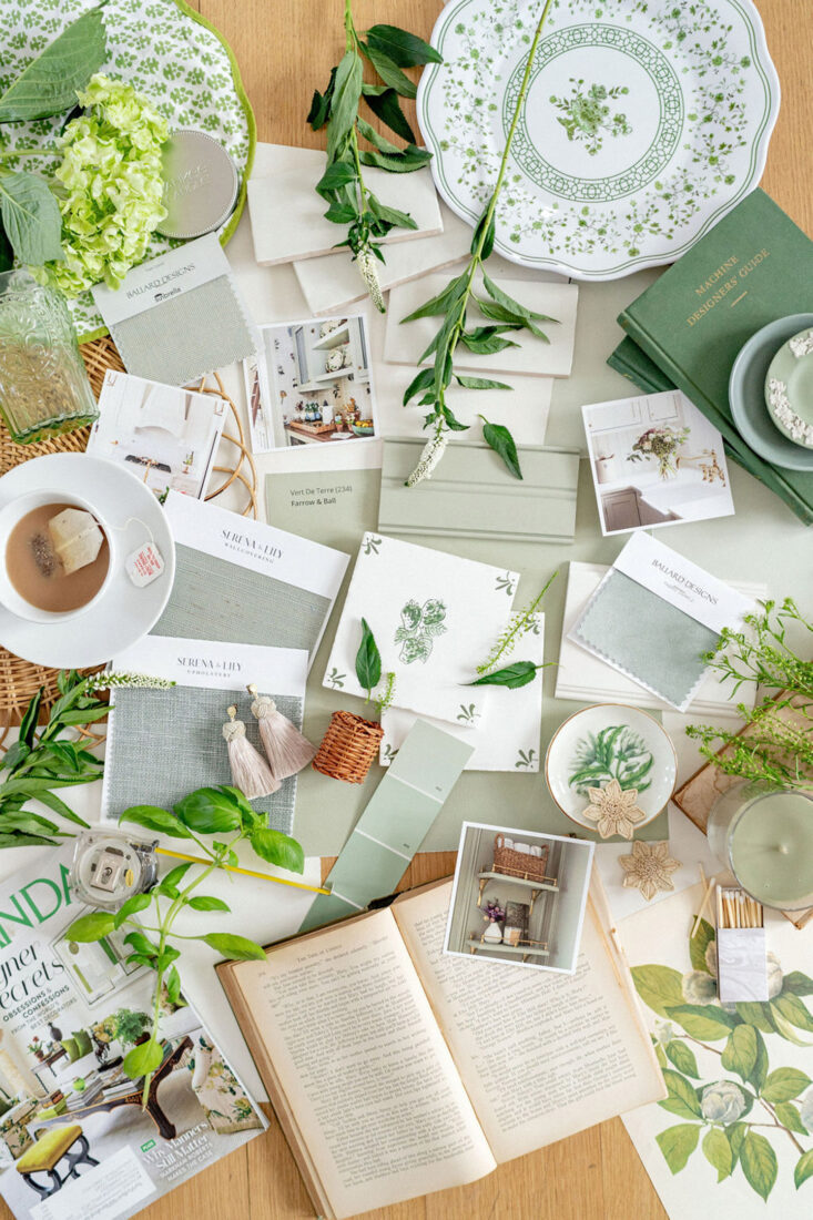
So when we started talking through the plan for a soft white and sage kitchen with our Interior Designer Jennifer Patterson of Terra Designs, it was a conversation focused around ‘how we live our lives’. I so appreciate Jennifer’s approached in that way. From day one, she wanted to understand US. Our lifestyle: do we entertain, do we have kids, dogs, where do we spend most of our time, do we drink coffee, tea, etc. And I think that’s so incredibly important. Because not every couple or family is the same in how they function within a home. Designs and layouts need to flow and work for you!
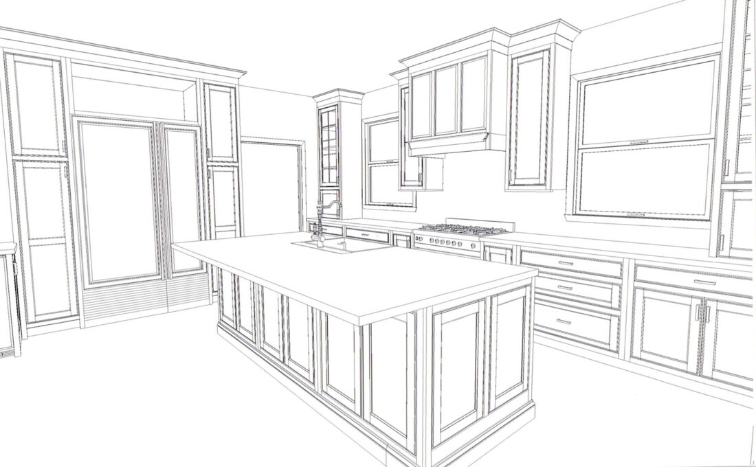
Initial Plan
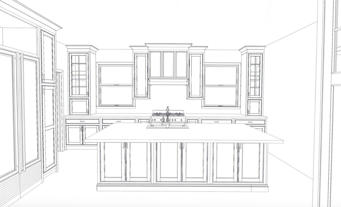
In addition to the overall aesthetic vision of this soft white and sage kitchen, the layout proved to be bit tricky. Re-configuring this kitchen was the biggest challenge from day one. Between myself, Sterling, our Contractor, Jennifer, vendors + subs – I think there were at least 6 different ways to layout this kitchen discussed at one point or another. I originally wanted to actually flip the entire room around and have the kitchen anchored on the other side of the house. Alas, that ended up not being the greatest idea {shocker haha}.
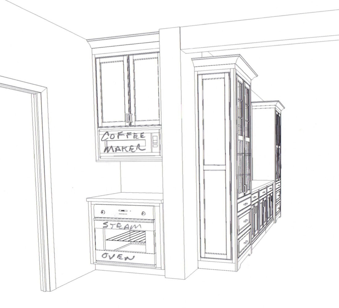
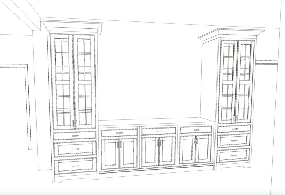
Ultimately I am THRILLED with what we came up with layout wise. We were able to squeeze in everything we wanted, and then some! Below is a straightforward view of the kitchen, looking from the breakfast nook. The wall to the right will house a large, custom hutch for entertaining items. Bar is on the left wall, along with paneled fridge/freezer. Around the corner to the right is a nook we converted from a second staircase entrance to a functioning part of the kitchen. It will house a plumbed-in espresso maker {Sterling deserved something he was really excited about – espresso maker and badet were his two requests hahaha}, along with a steam oven. The later I am equally excited and nervous to figure out how to use.
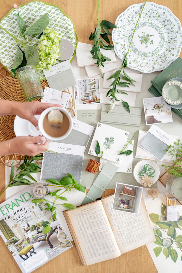
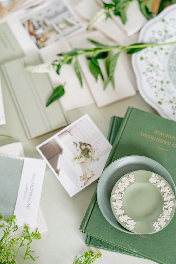
Color Selections
KITCHEN + BAR CABINETS
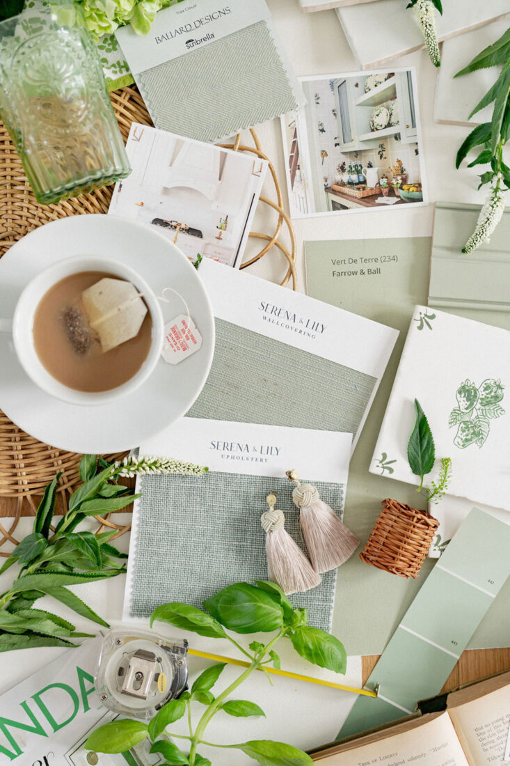
Mouser Cabinetry Manufacture color called ‘Divinity’, it’s a beautiful soft white
HUTCH + PANTRY
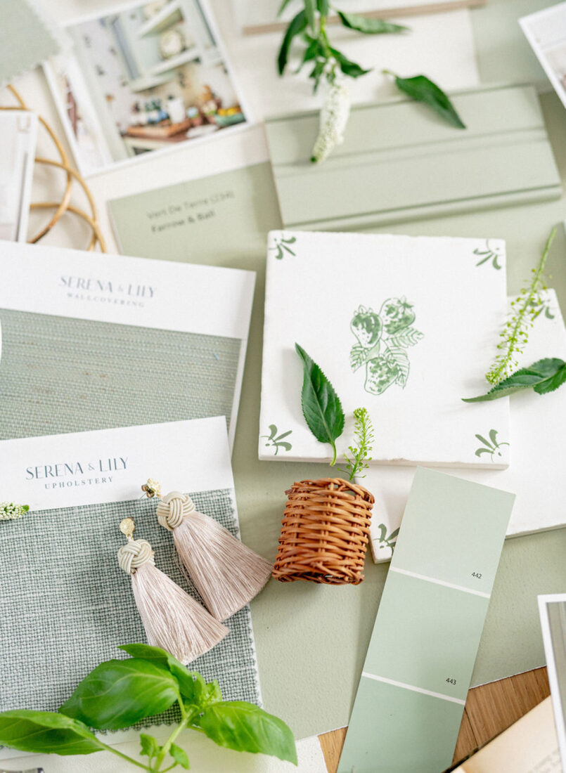
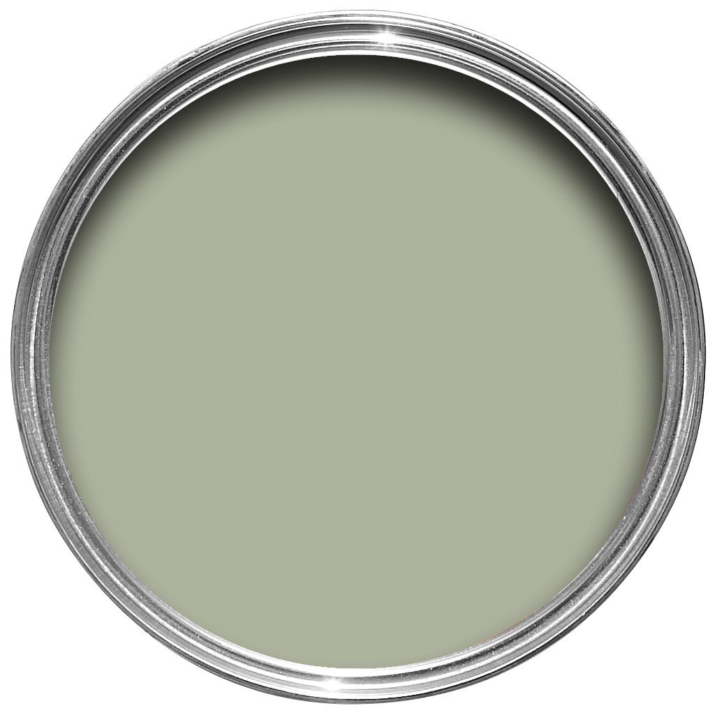
Mouser Cabinetry Manufacture color ‘Reef’; identical to Farrow & Ball’s Vert de Terre
WALLS
Benjamin Moore Sheep’s Wool
TRIM + CEILING
Benjamin Moore White Dove
Bar Plan
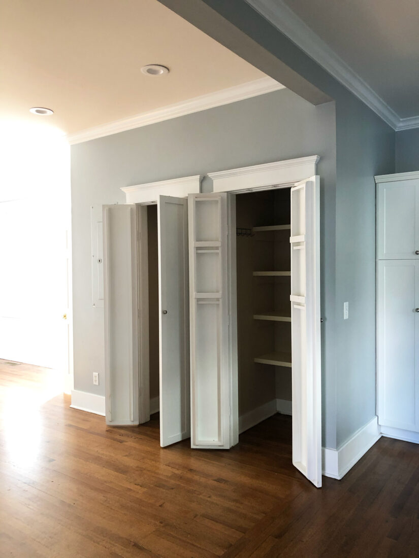
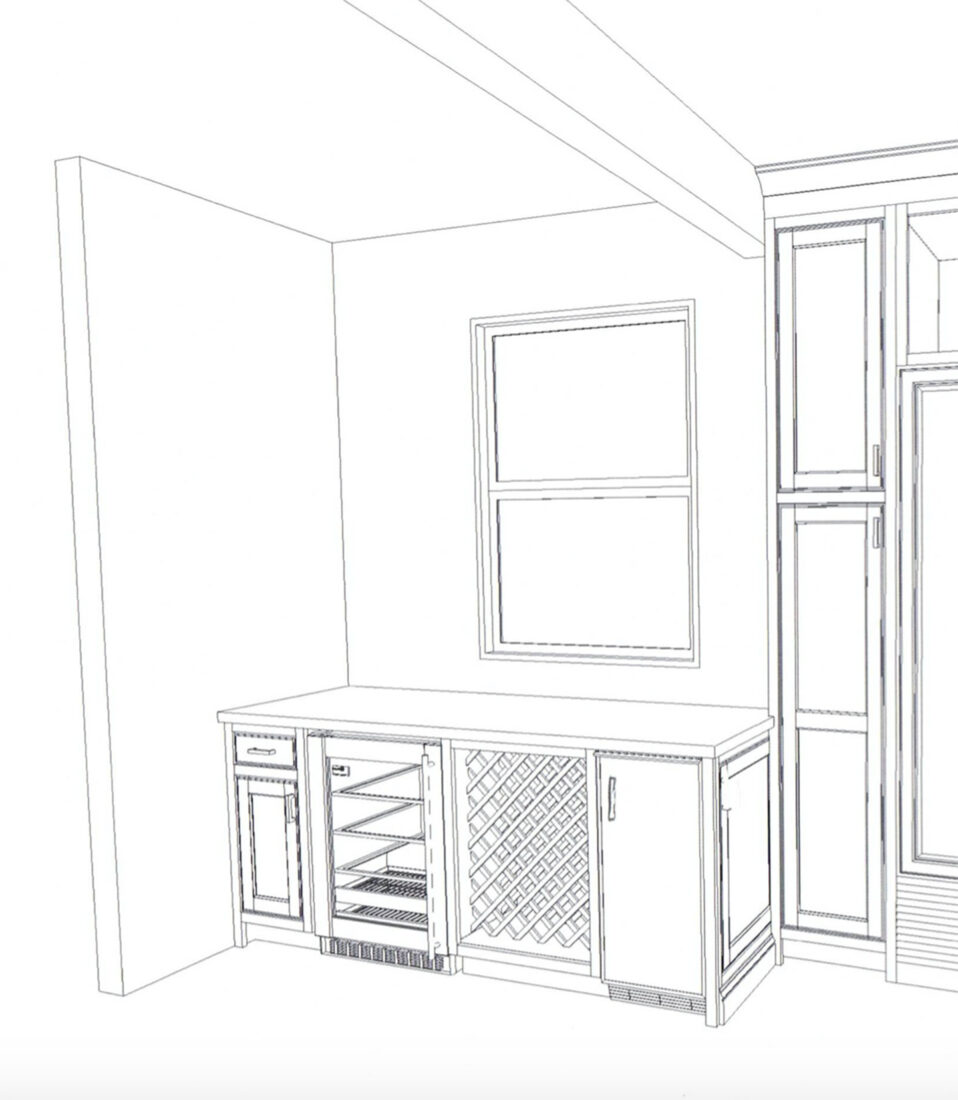
This corner of the kitchen is one of my favorites because it was such a challenge to reconfigure! It was originally an enclosed powder bath, then converted to a pantry {with the exterior window blocked out} when an addition was added. When we were working through ways to gain back the window and make it a functioning area of the kitchen, so many idea were thrown around. Ultimately when our cabinet maker suggested a bar area, it just clicked!
The below counter area of the bar will have a liquor drawer, wine fridge, wine lattice for storage and an ICE MAKER. Pellet ice to be exact. If you know you know. This is my literal dream come true!!! Can’t tell you how excited I am about this ice maker. This area will also be great for an additional prep/serving area!
Delt Tiled Bar
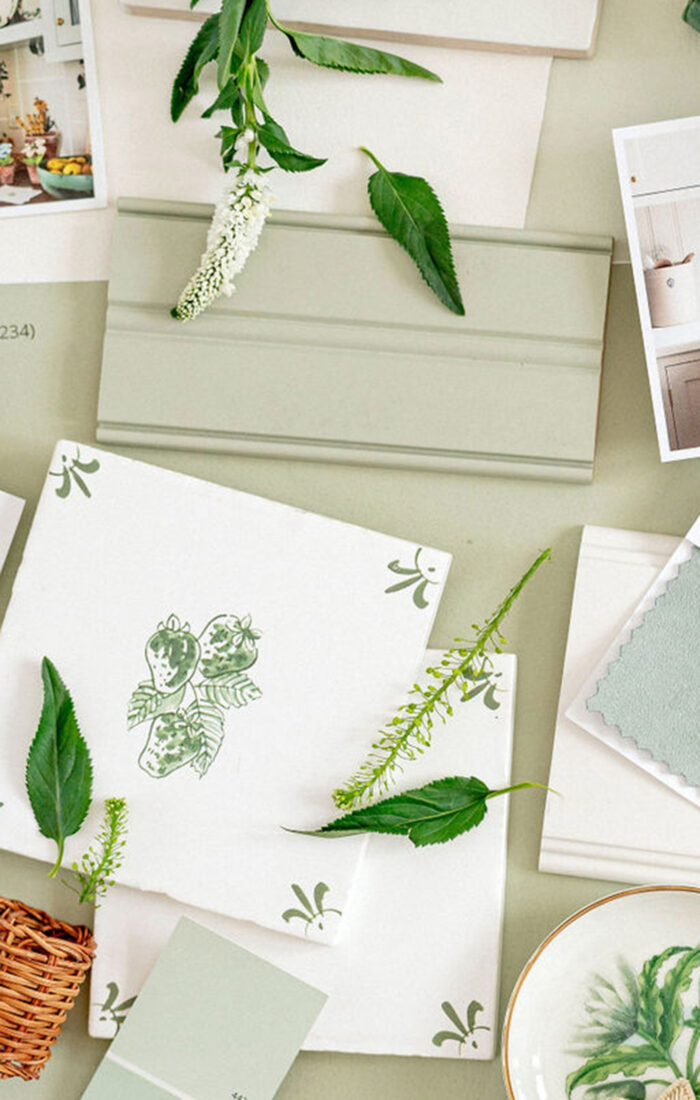
While the majority of the kitchen is classic, traditional, and a bit more muted, I’d for the bar to have a little different feel to it! Think it will break up the ‘same look’ and also add as a fun accent area.
I searched high + low for delt tiles that spoke to me, and came across these strawberry tiles by Petra Palumbo. They’re even more stunning in person! But ultimately they ended being out of our budget for this area. So we’re currently in the brainstorm phase of how to execute this vision, and think we’ve come up with a great solution! Will share more on that process as it unfolds.
Will be pairing the accent delf tile wall with a beautiful wood countertop for some contrast.
Above the Island
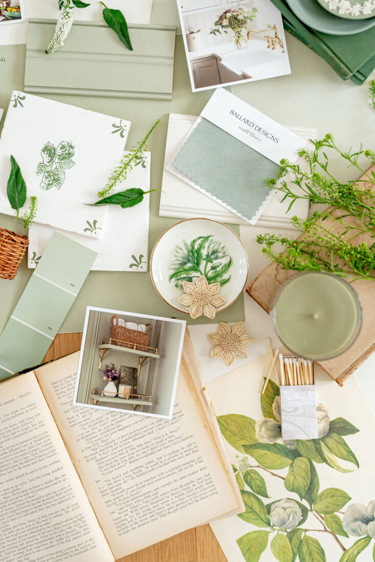
To compliment the soft white and sage kitchen cabinetry, we’re going with brass accents. Not all of the brasses are exactly the same. And while that’s something that may usually make me nervous, I’m learning they will all blend with the other elements in the room and make it feel more layered. Thank you Jennifer for that!
After much debate, we selected the Sloane Single Pendant with White Glass from Circa Lighting. I’ll be honest, I’m still nervous about this one! Not sure why, but of all the lights in the house, the pendants were the hardest for me to envision and make a decision on. I really didn’t come across anything that said ‘that’s the one’. So ultimately, I’m trusting our Designer on this one. Sterling really likes them as well. But fingers crossed!
Plumbing + Hardware
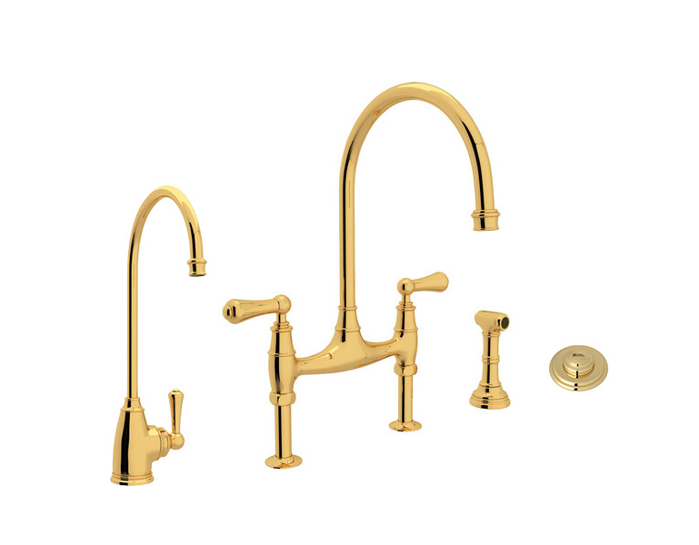
This unlacquered brass faucet suite was a bit of a splurge, but I could not be more excited for it to see a showpiece in the kitchen. The unlacquered finish is a ‘living finish’, so will patina over time, which I love. In addition to the main faucet + side spray, we’re also including an instant hot faucet for tea! I don’t drink coffee, so having instant hot water for tea at any given time will be such a treat!
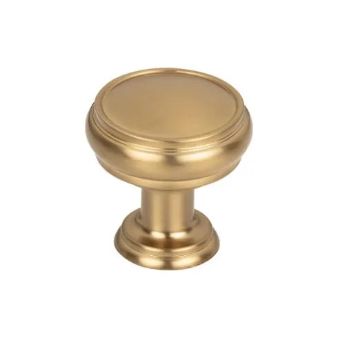
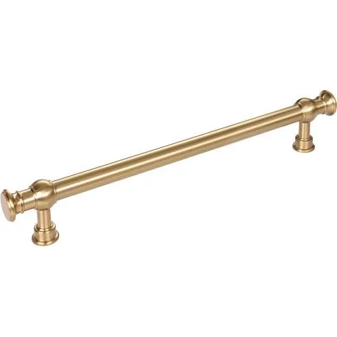
Primary hardware on the soft white cabinetry throughout the kitchen will be Ormonde Pulls + Eden Knobs in honey bronze c/o Top Knobs. We knew that while we would have loved to carry the unlacquered brass finish throughout, it would have been very costly. Jennifer recommended Top Knobs honey bronze as a beautiful alternative. I actually ended up falling in love with these styles {specifically the Ormonde Pulls} more than the unlacquered options. Win win! Could not be more thrilled and grateful to be partnering with Top Knobs on this renovation – more to come on the final reveal!
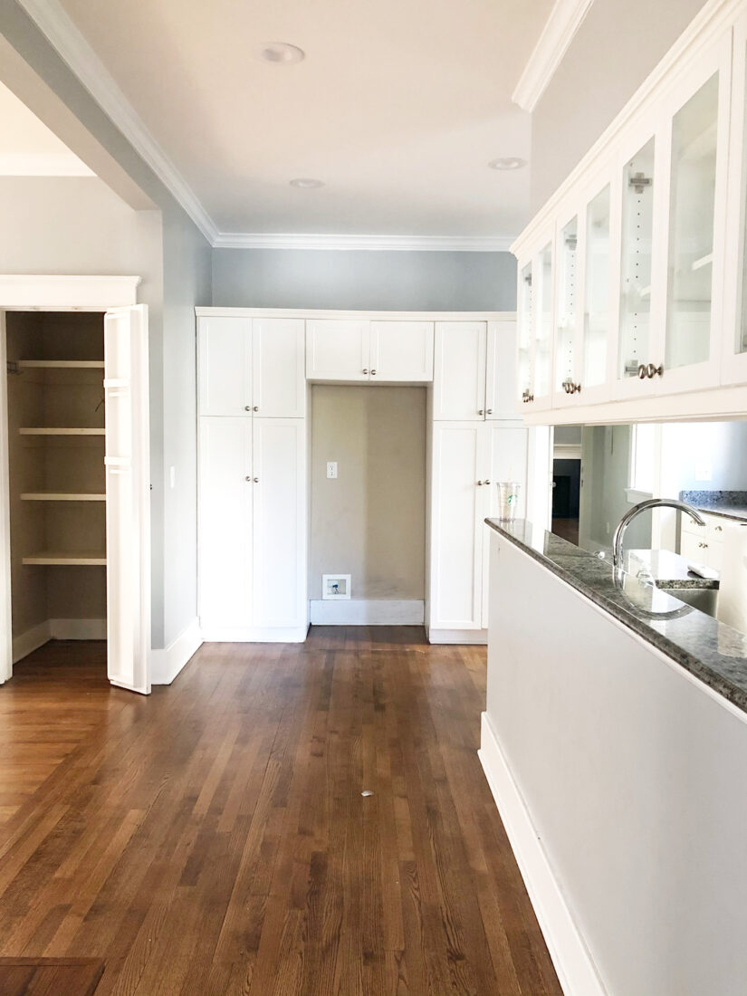
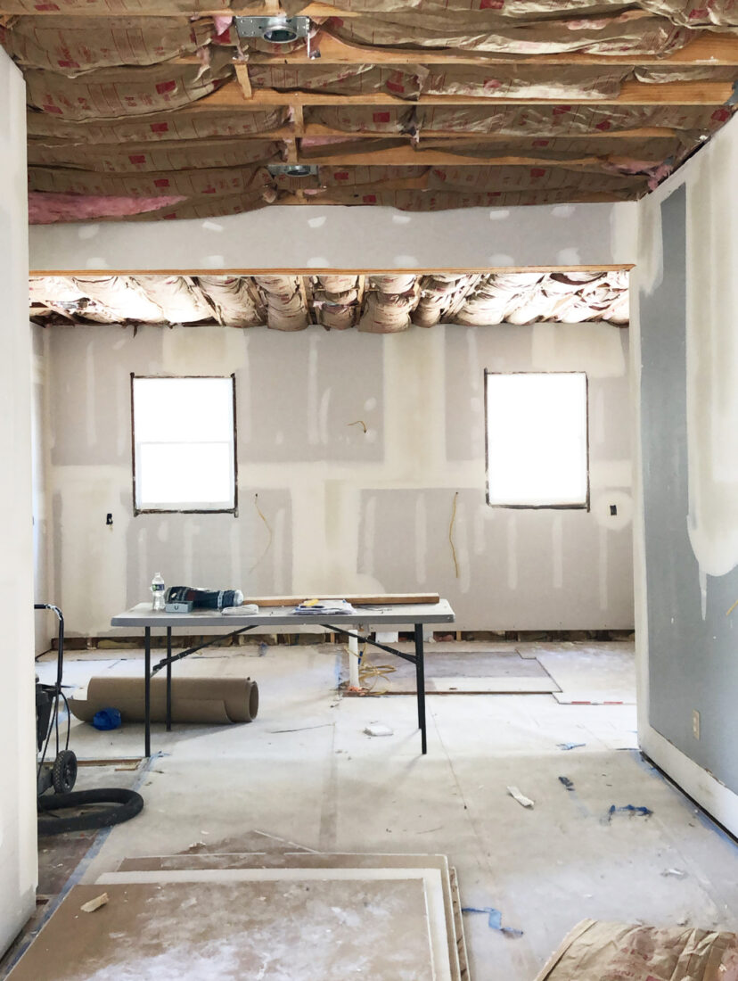
A Peek at the Before…
For More Home Inspiration
Be sure to check out the vision for our Blue Laundry Room, as well as the Garden Green Family Room!
Images by Marni Rothschild Durlach
Moodboard styling by Candice Lorraine + your’s truly
Room Design by Jennifer Paterson of Terra Designs

