
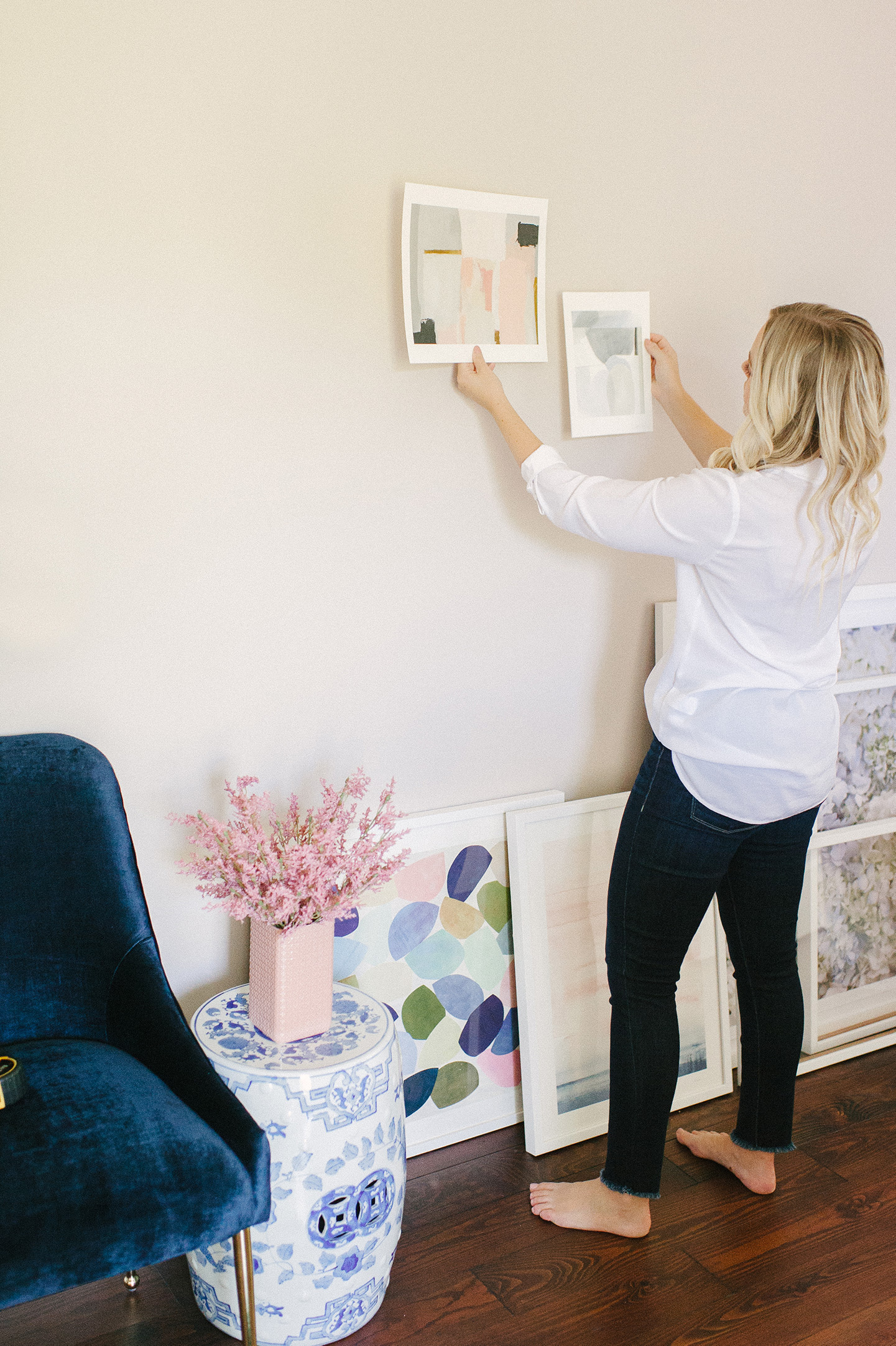
Selecting art for your home is such a personal experience. And while I wish I could say I’ve finally perfected it for our home, it’s something that’s always evolving! That’s the fun of it though, right?! Thankfully, Sterling and I do surprisingly have very similar taste in art. I say surprisingly because he’s more of a ‘guy’s guy’, and I’m clearly very feminine. When it comes to art though, we gravitate to similar styles and color ways, which helps. So when I begin piecing together a gallery wall color story with Minted Art, he was on board.
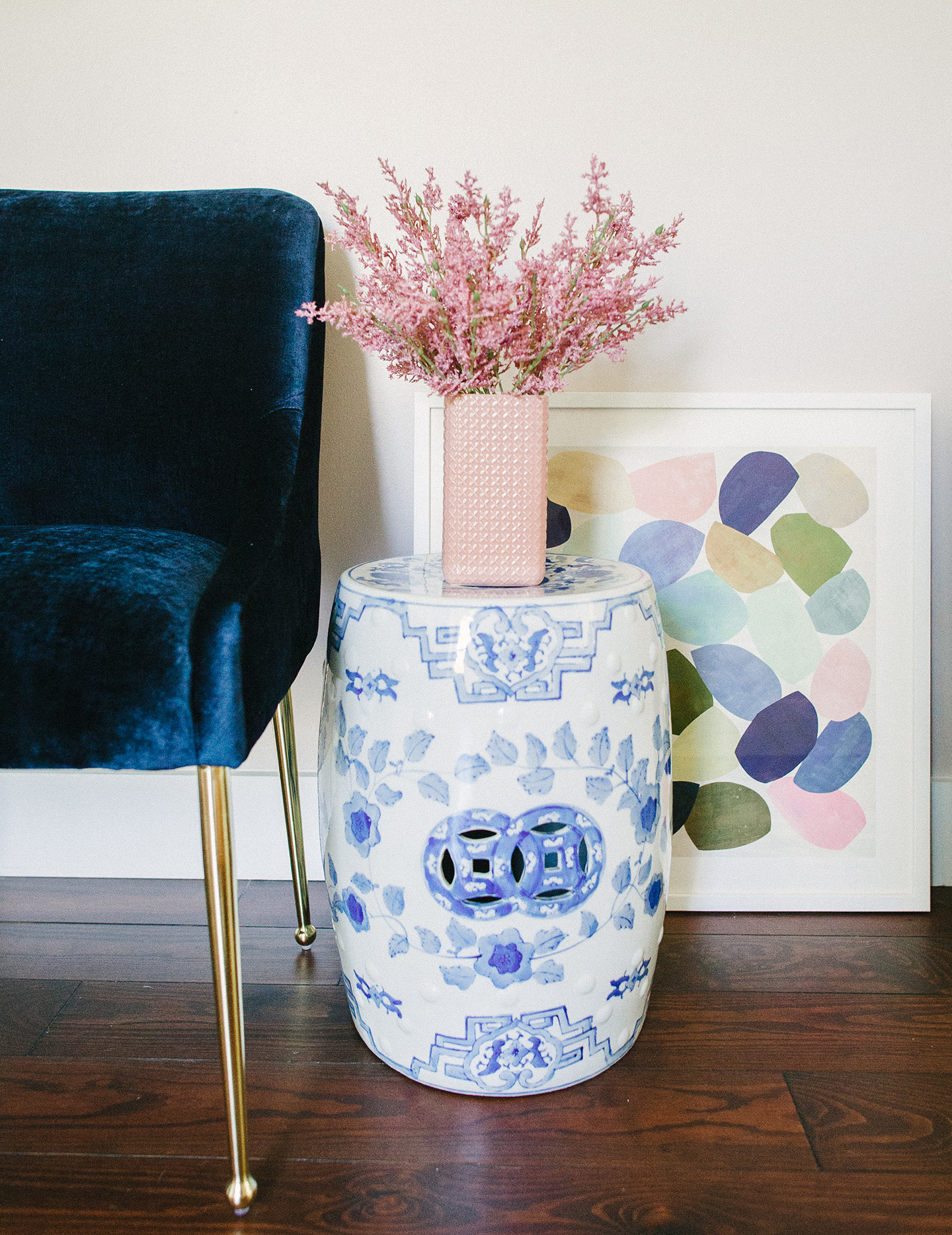
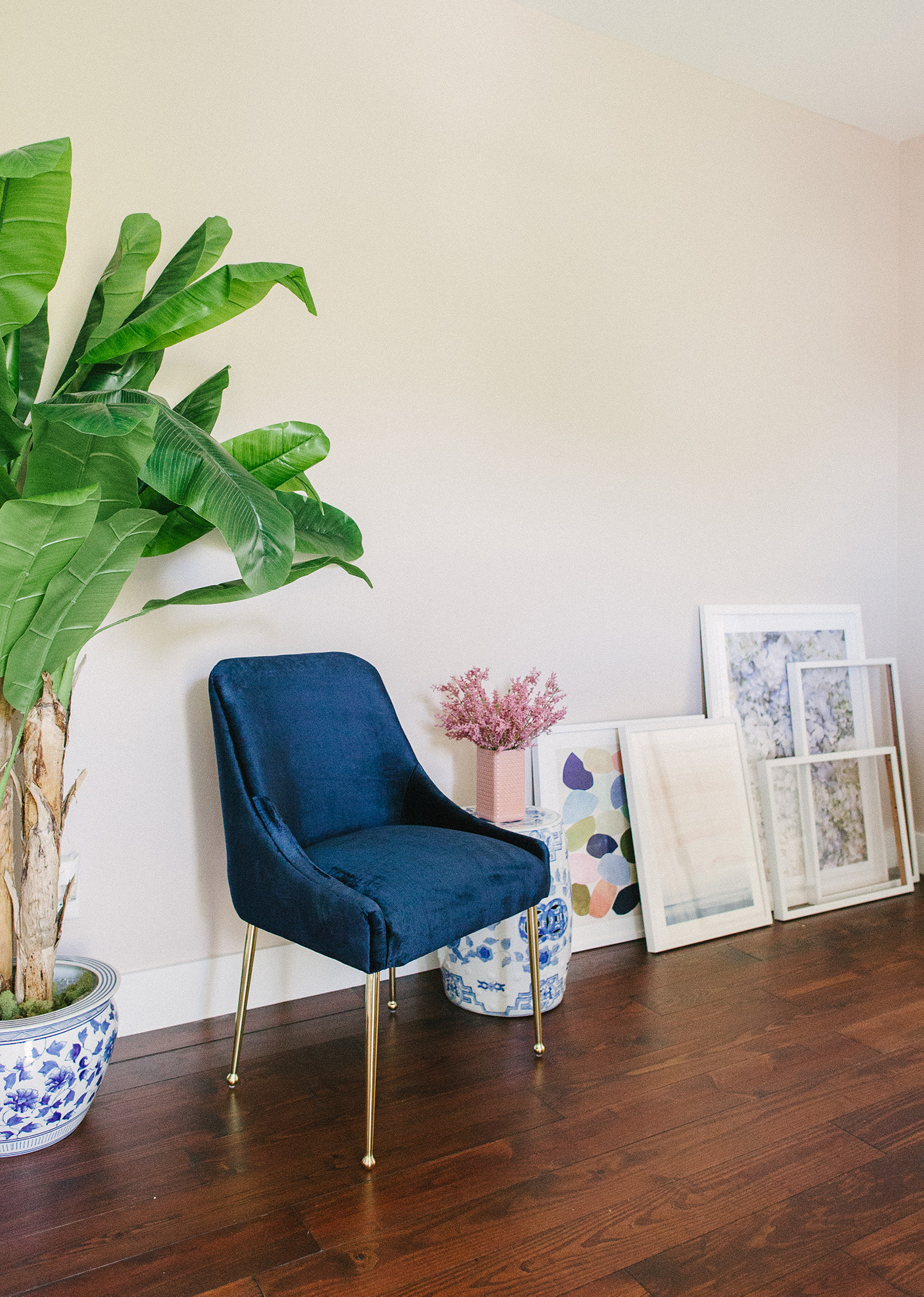
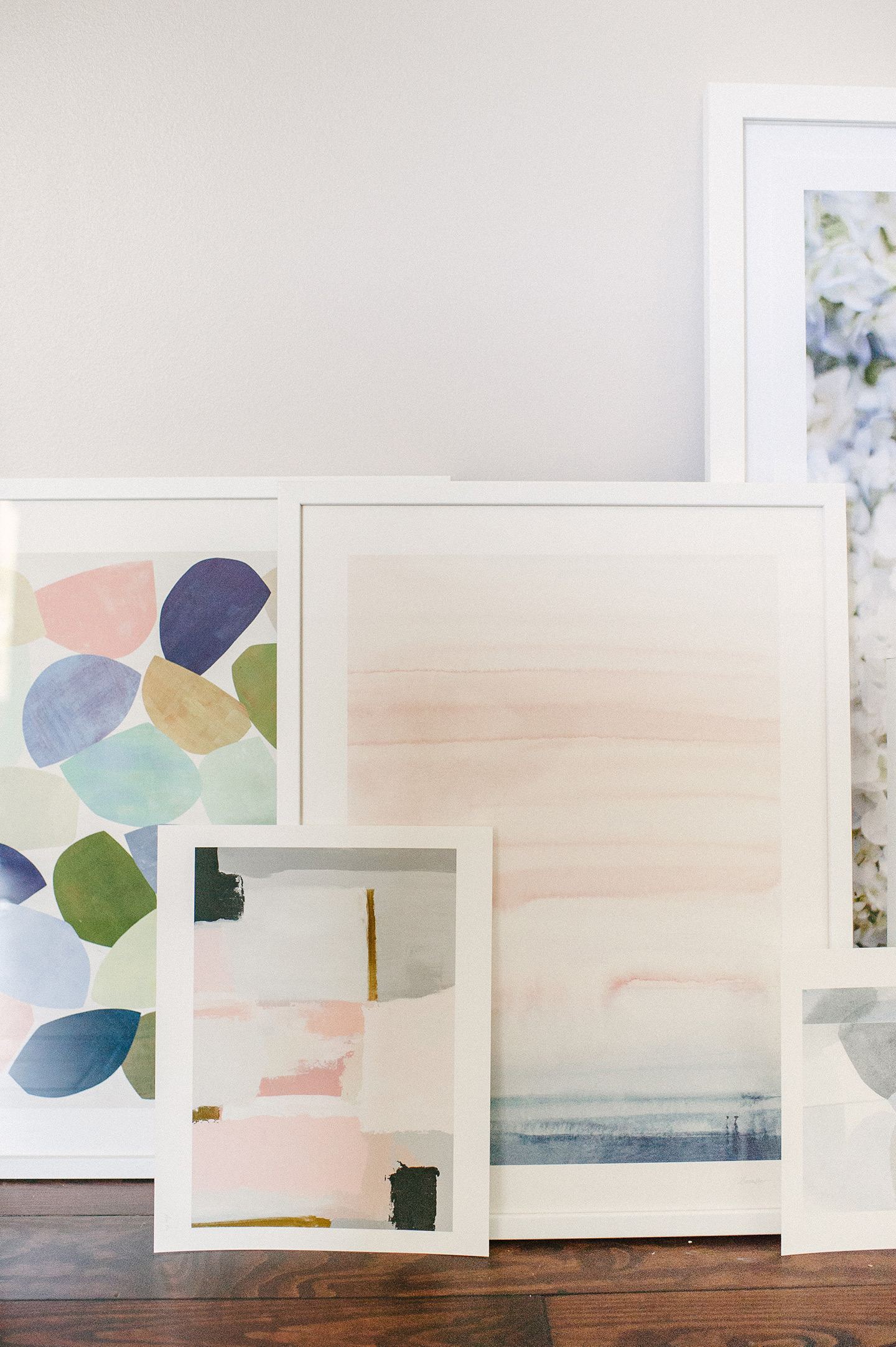
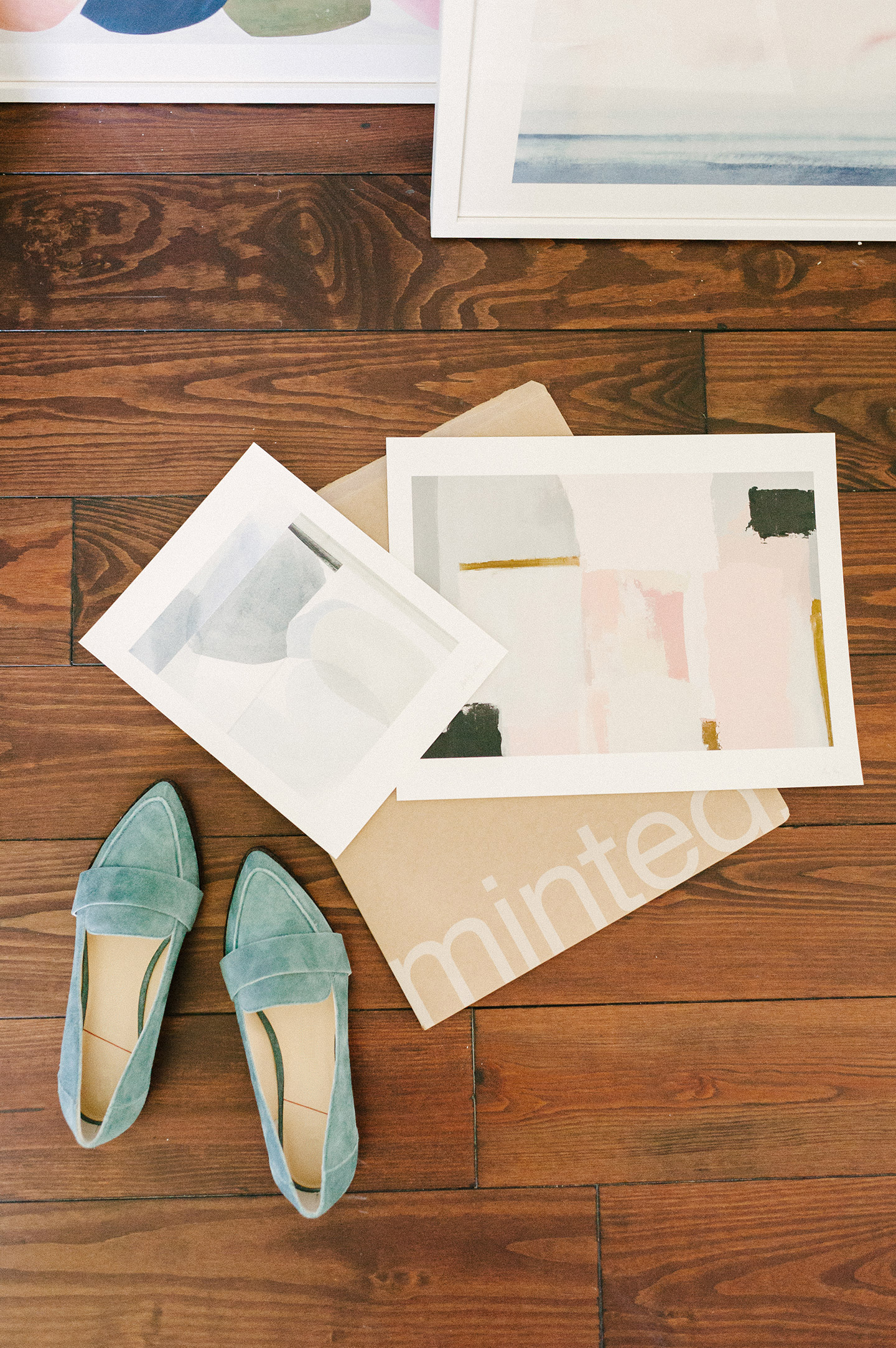
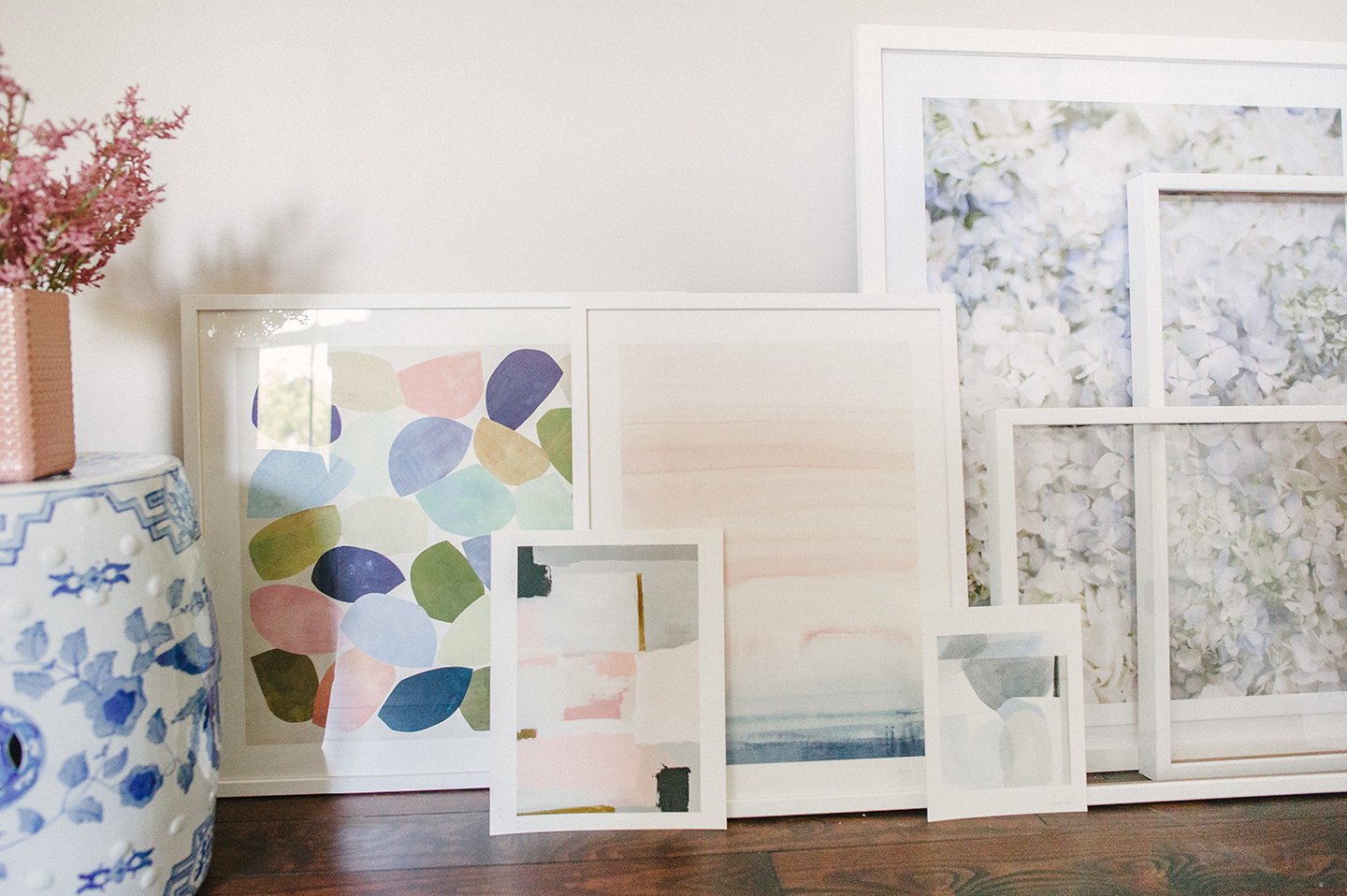
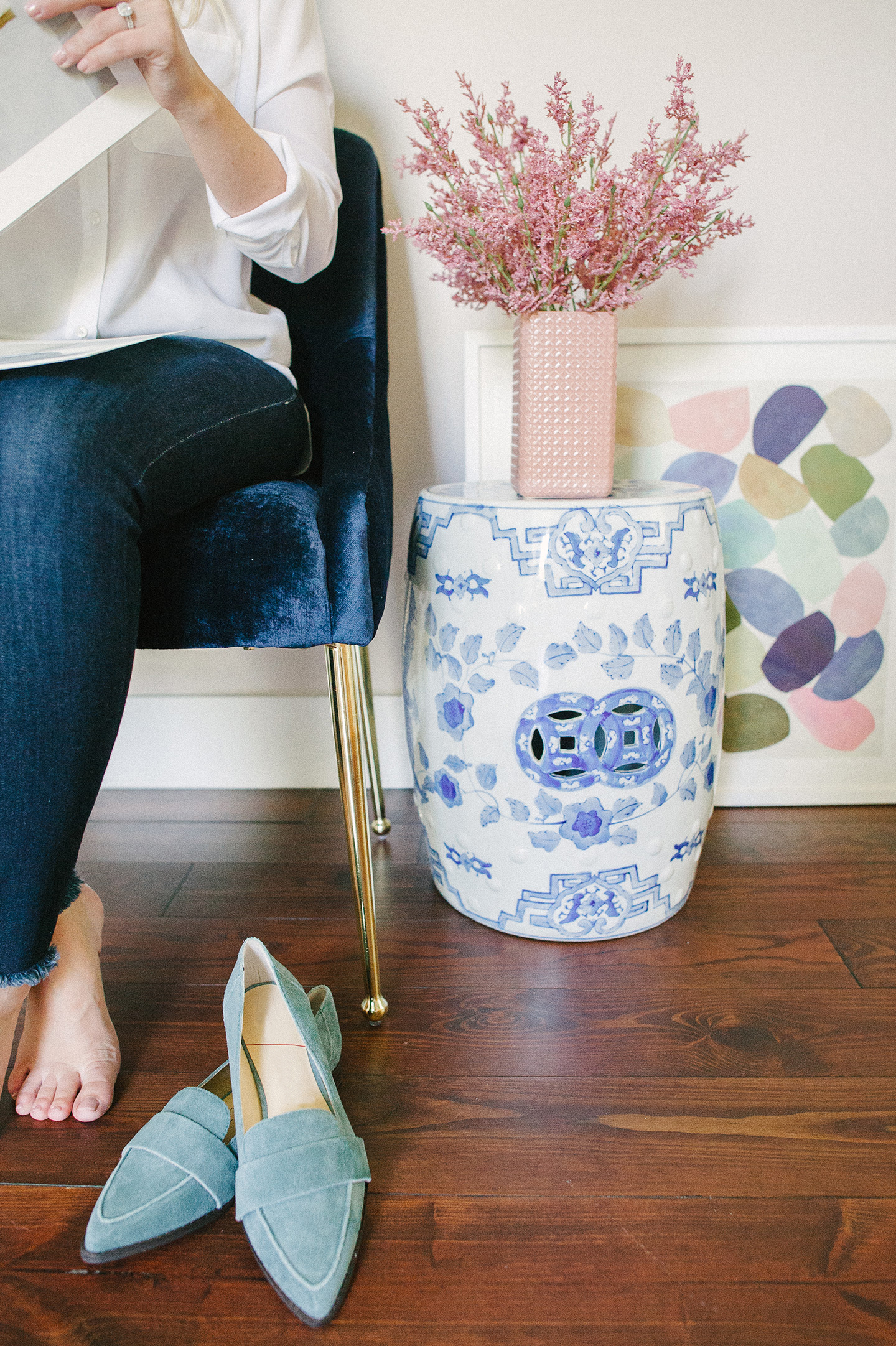
When you’re honing in on a gallery wall color story, here are a few things to consider: your overall home ‘style’ {i.e. contemporary, modern, etc}, your primary wall color and floor color. I’d say our home is a mix of traditional and modern, although that’s always shifting as well! Haha. I’ve really been into the whole Palm Beach Regency design style lately, which can be easy to find/incorporate in Charleston. Alas, I’m getting off topic. Back to art. As I was looking through the Minted Art new arrivals, I was drawn to soft hues of pink + blue {not surprisingly, if you could see the rest of our home} I came across within a couple different artists’ work. Although from different artists, all four of my selections pair together beautifully! I’m still debating on frames/matting options for a couple, but aren’t they precious?! Love the layered look.
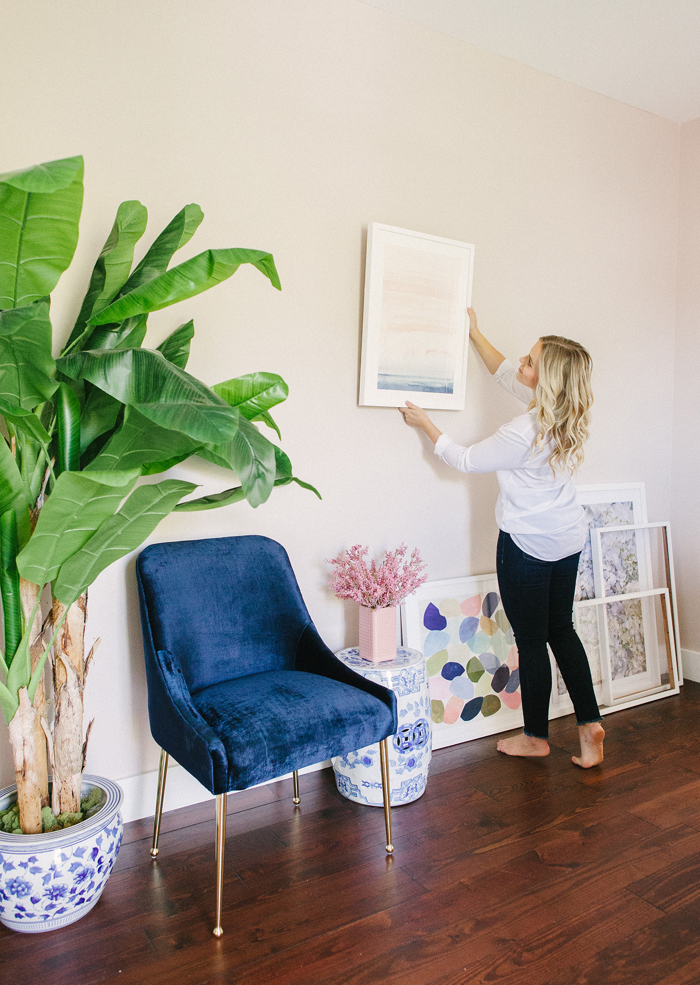
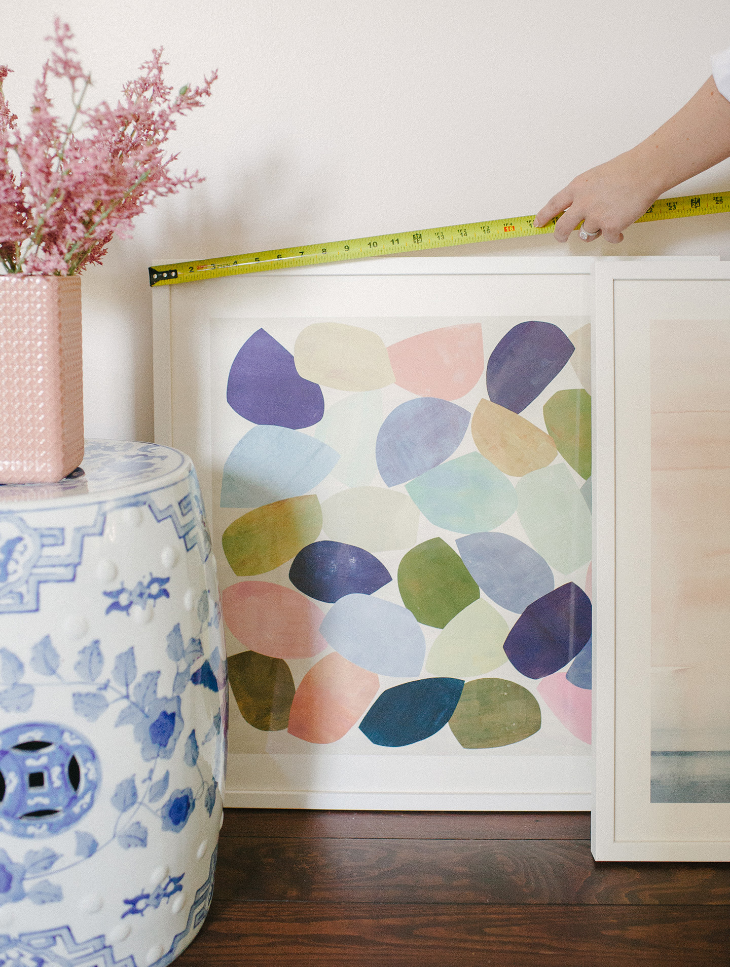
The floor and wall colors we’ve chosen throughout our home already add amazing contrast to the space. I’ve loved them hardwood floors since the day we moved in. They’re classic and neutral enough to pair with any art style. With the mix of furniture and decor style {modern + traditional} within our home, I opted to keep the frames more neutral and minimalistic with white x white. It’s a great, clean look for us, and really helps the art pop off the pinky beige walls. But for example – if you have white walls, I’d recommend opting for a natural wood or metallic frame for added contrast.
Most importantly when you’re selecting a gallery wall color story, is to just have fun with it! Be true to your style, and what you love. Art should be FUN to look at, and enhance your space – there’s no right or wrong.
Photos by Julie Livingston Photography
